Concept project
Empowering justice through accessible legal information and tailored support


How can I help people to understand and assert their legal rights?
Most people don't know their legal rights, or how to enforce them. This became clear during my university volunteering, where I assisted individuals representing themselves in court, and individuals applying for Personal Independence Payments. Furthermore, even if people do know how to enforce their rights, my experience as a legal recruiter revealed significant variations among firms—not just in specialties but also in price, reputation, culture, and size, to name a few. These subtle differences between firms can vastly affect the experience. For those I volunteered with, navigating this complex landscape was overwhelming.
While many apps provide AI legal information, none effectively guide users to legal support. I created Black Letter to solve this problem, offering clear legal insights and connecting users with firms or charities to match their needs.
Validating decisions through 4 rounds of testing
I grounded the design of Black Letter in competitive analysis and extensive testing to ensure the product was validated by real-world needs and market positioning, rather than by my assumptions.
Competitive analysis shaped the app’s core features:
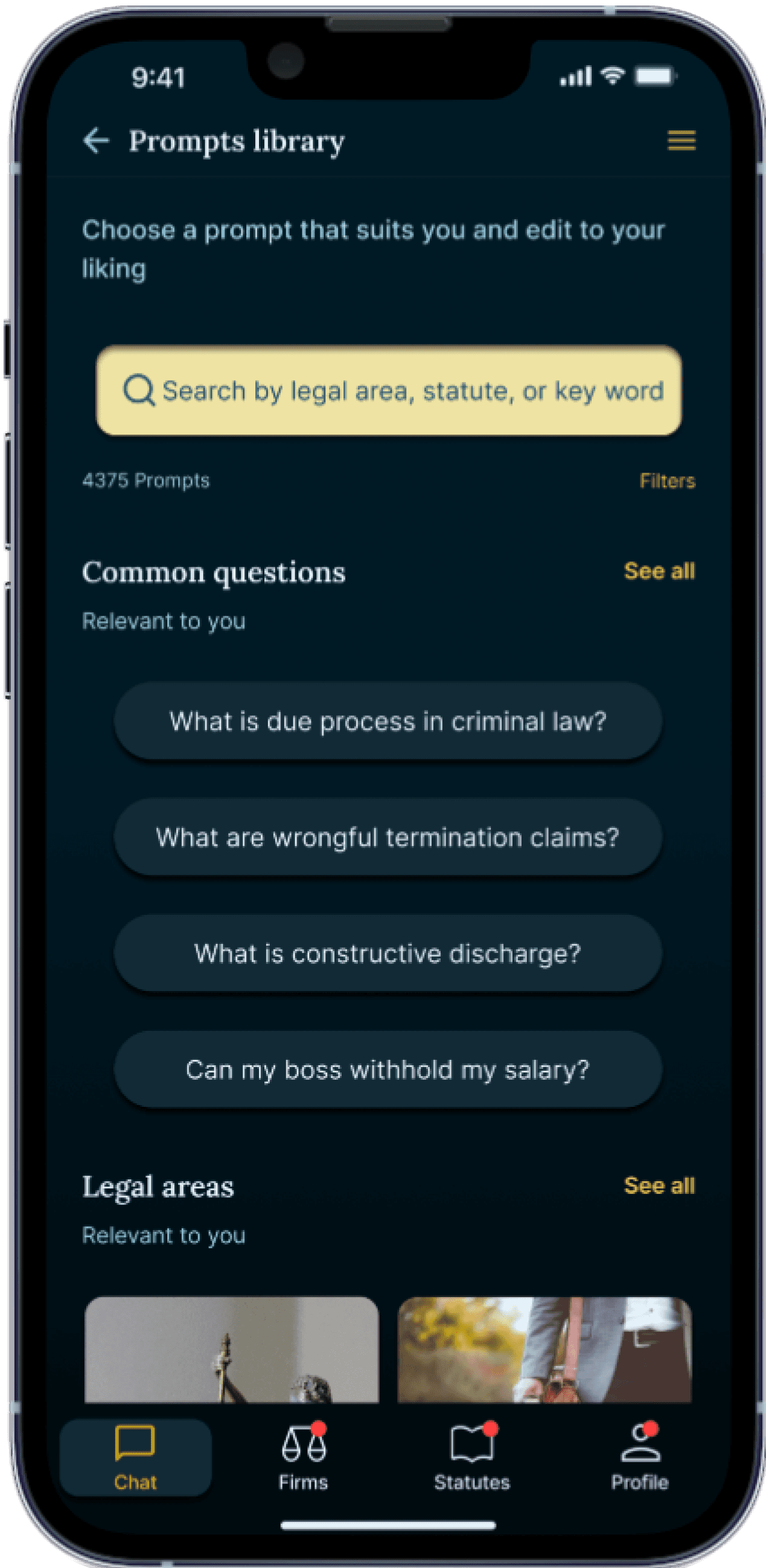
AI chatbot and prompts library to help users identify legal issues and navigate common legal questions
Statute library offering structured access to relevant laws and case law
Law firm and charity directory with a referral scheme to match users with the right professionals
Profile section for saving essential information
With these foundations in place, I prioritised rigorous user testing, employing both quantitative and qualitative methods to validate design decisions and enhance the user experience. This iterative process was crucial in addressing mid-project challenges, particularly in clarifying the target demographic and optimising the referral scheme.
Through continuous testing and refinement, I ensured that Black Letter evolved into a streamlined, user-focused solution that demystifies legal information and connects users with the right support, bridging the gap between awareness and action.
1. Defining the product
Defining product type and user needs
After identifying the problem, my competitor analysis revealed a significant gap in legal tech. While consumer-facing legal apps are popular for their accessibility and convenience, most only offer basic AI-driven guidance without jurisdiction-specific depth and fail to connect users with the right legal professionals.
User reviews indicated frustration with relying solely on AI. Although users appreciate AI assistance, they need a smooth transition to professional legal help, which aligns with my personal experience and hypothesis.
To address this, I decided that my product would be an app, to ensure easy and convenient access to legal information and support. It would retain AI support while bridging the gap by providing UK-specific legal information, direct connections to legal professionals, and a user-friendly experience. This approach would create the vital link between AI-driven guidance and genuine legal support, effectively addressing the pain points identified in my personal experience and competitor analysis.
Competitive analysis

Shaping core functionality
Building on my competitive analysis and legal experience, I designed the app’s core functionality around four key areas:
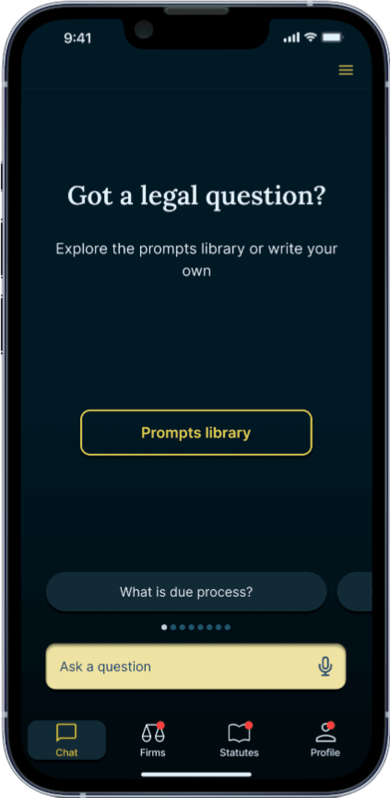
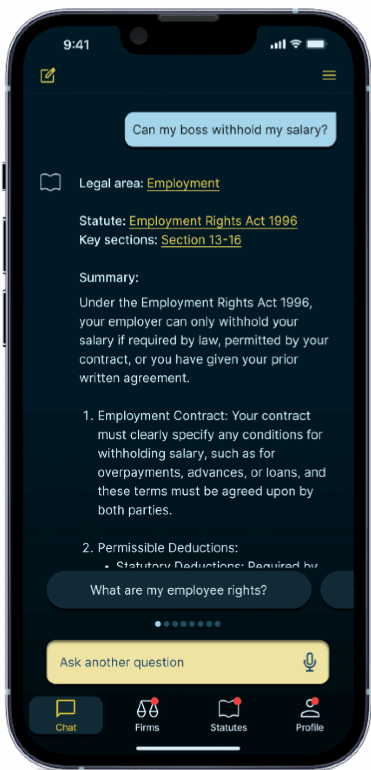
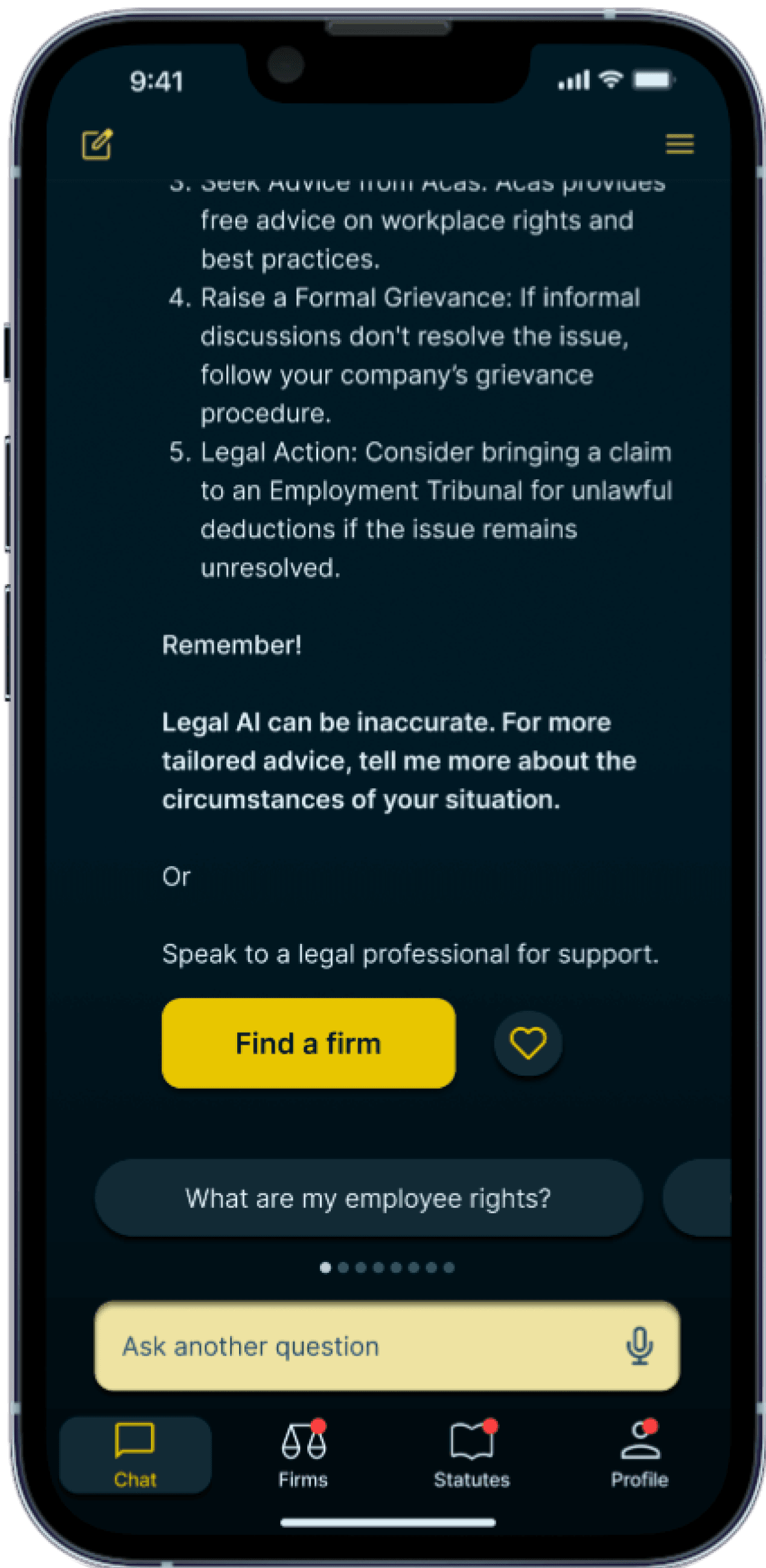
AI chatbot
Helps users identify their legal rights, linking directly to English and Welsh legal sources.
It features a prompts library to guide users through common legal queries and enhances existing models by providing recommendations, pinpointing legal areas, highlighting relevant statutes, and directing users to professional advice.
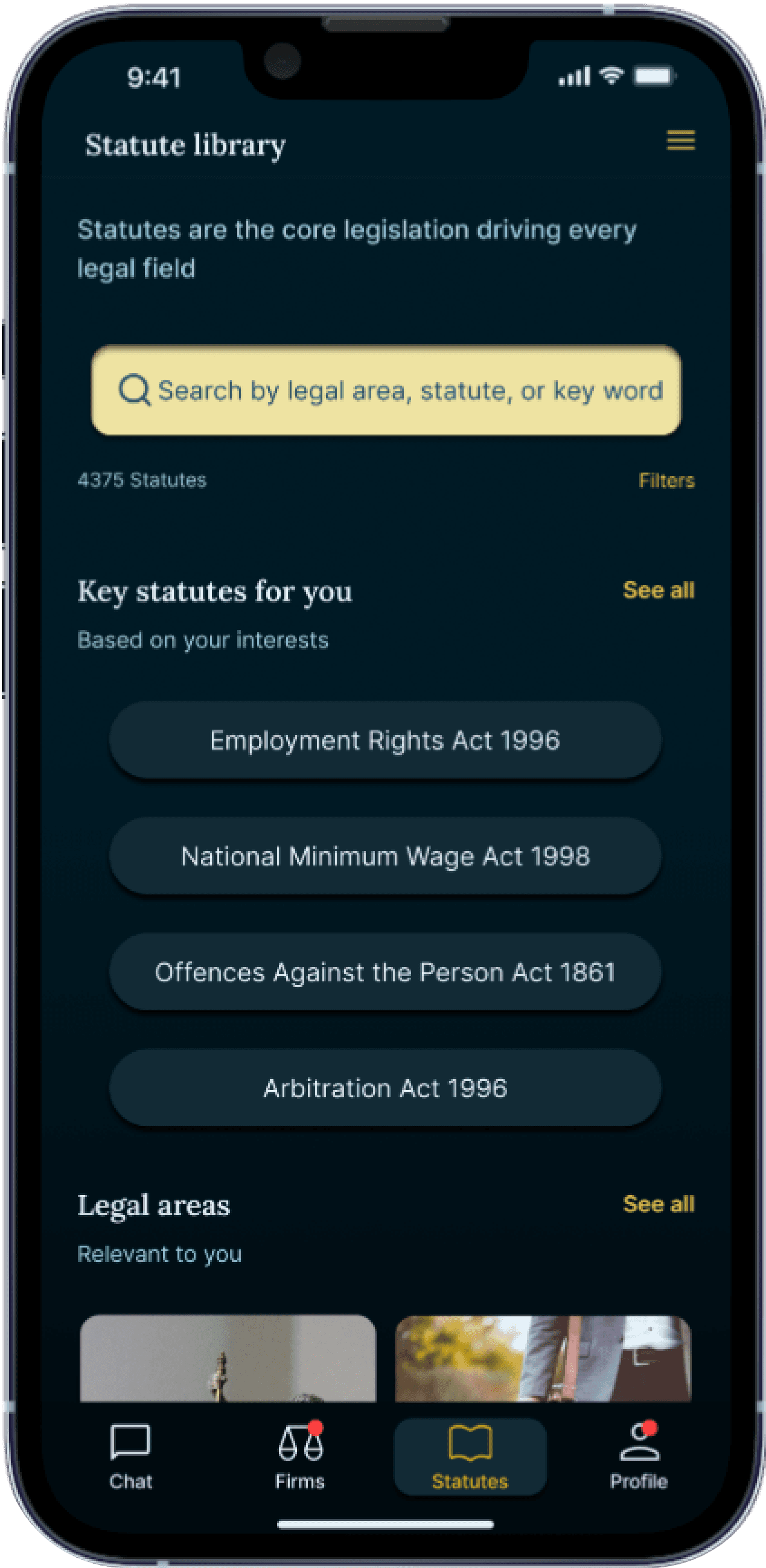
A statute library
Direct access to relevant laws, addressing the need for accessible legal information identified during my time volunteering.
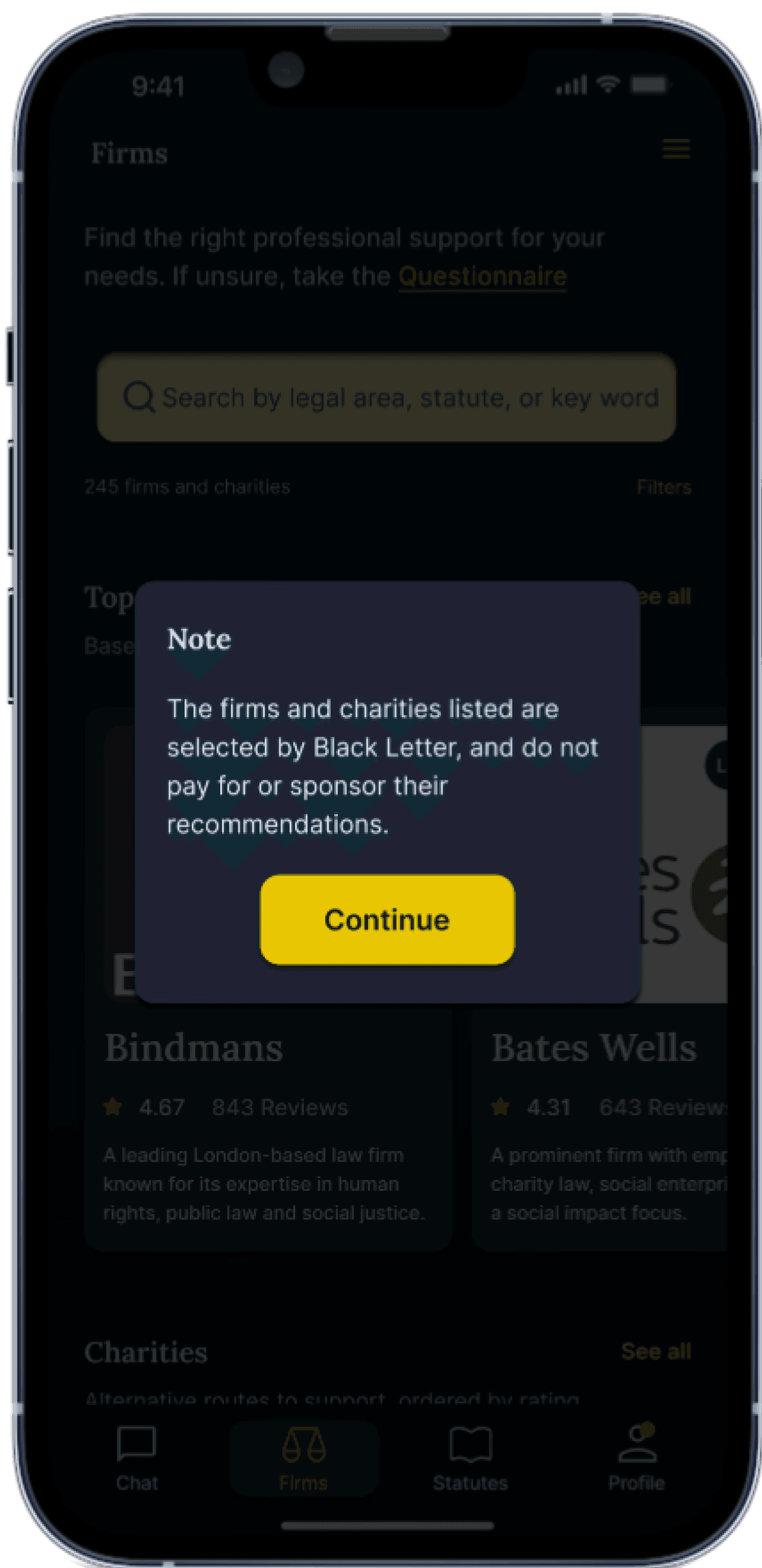
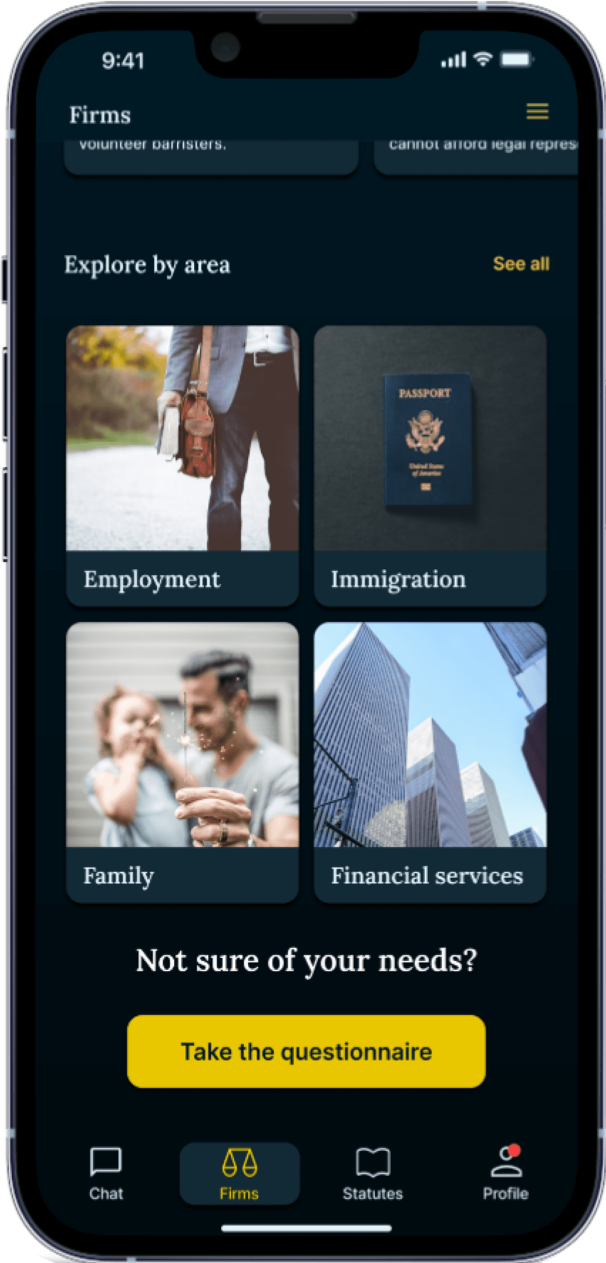
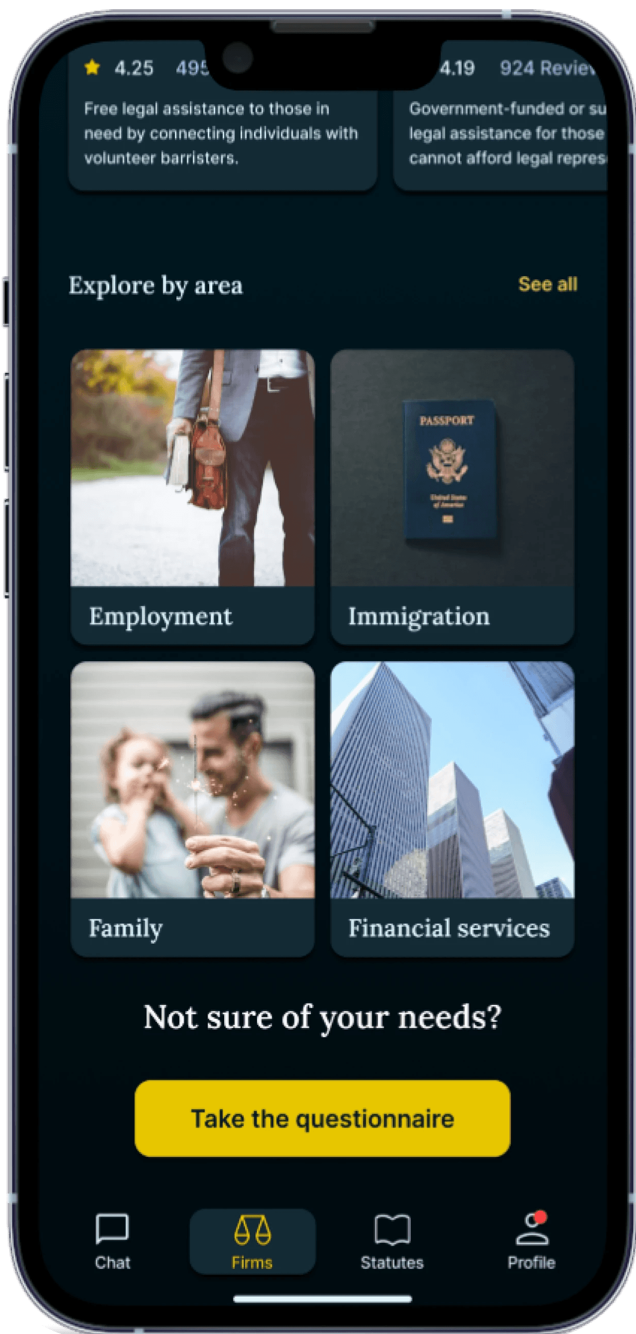
Law firm and charity directory
It uses filters and a referral scheme questionnaire to tailor referrals, tackling the challenge of finding the right professional assistance based on users' unique circumstances.
A personalised profile
For saving information, to meet individual user needs.
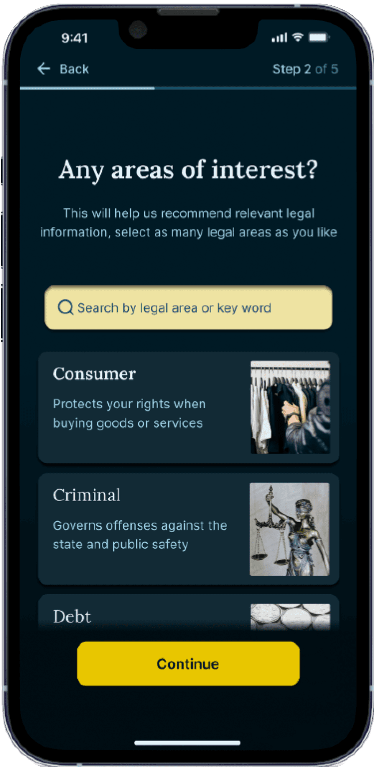
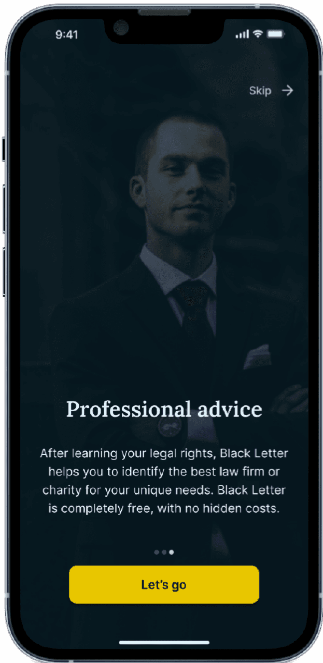
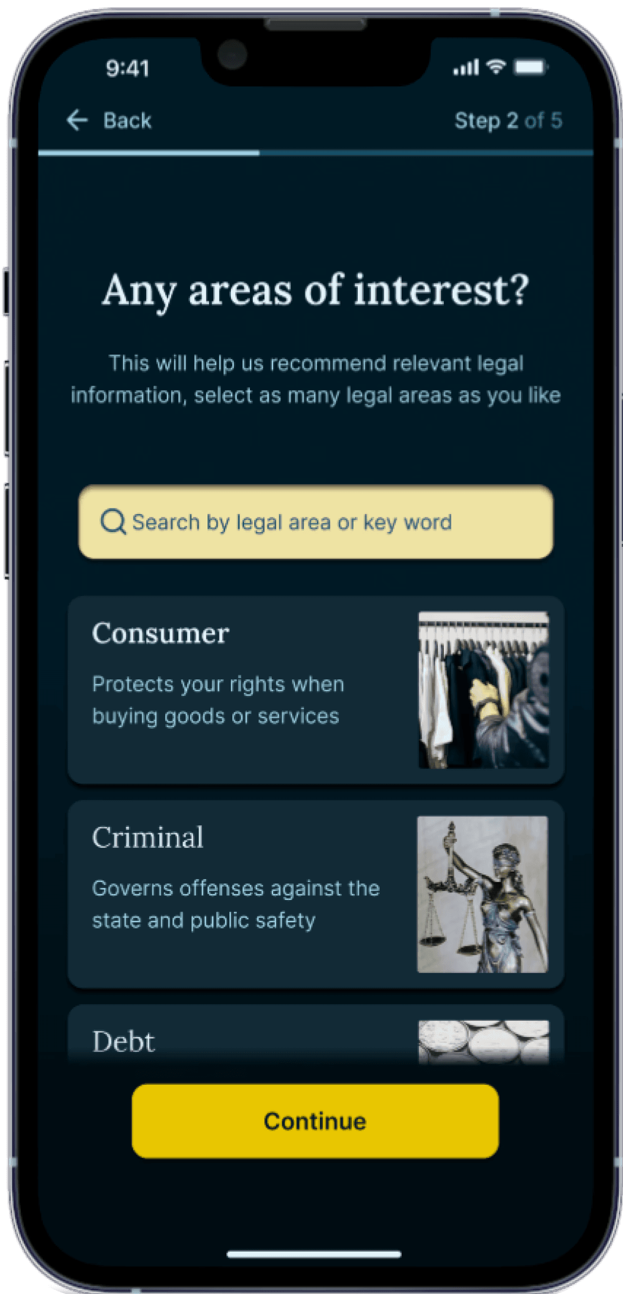
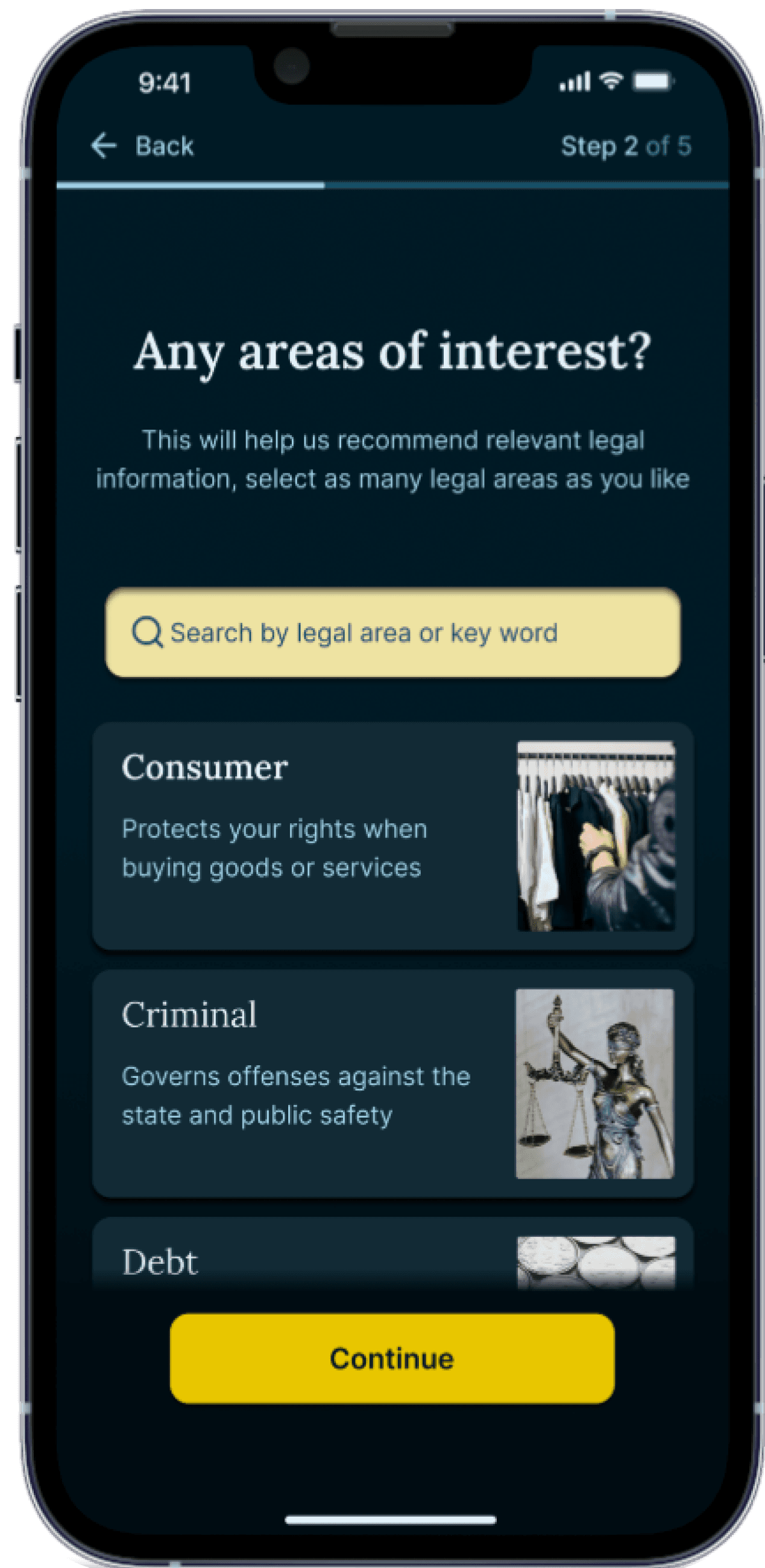
The app would also feature an onboarding section to introduce its purpose and allow users to personalise their experience by sharing which city they live in, their legal interests, and their reason for joining.
With these features, the app would address users' lack of knowledge about their legal rights by providing structured insights that clarify their entitlements. It would also guide users through the overwhelming landscape of law firms and legal charities, helping them identify the right professionals to enforce these rights effectively. By acting as a bridge to legal support, the app would simplify the process, addressing pain points and empowering users to navigate their legal needs with confidence.


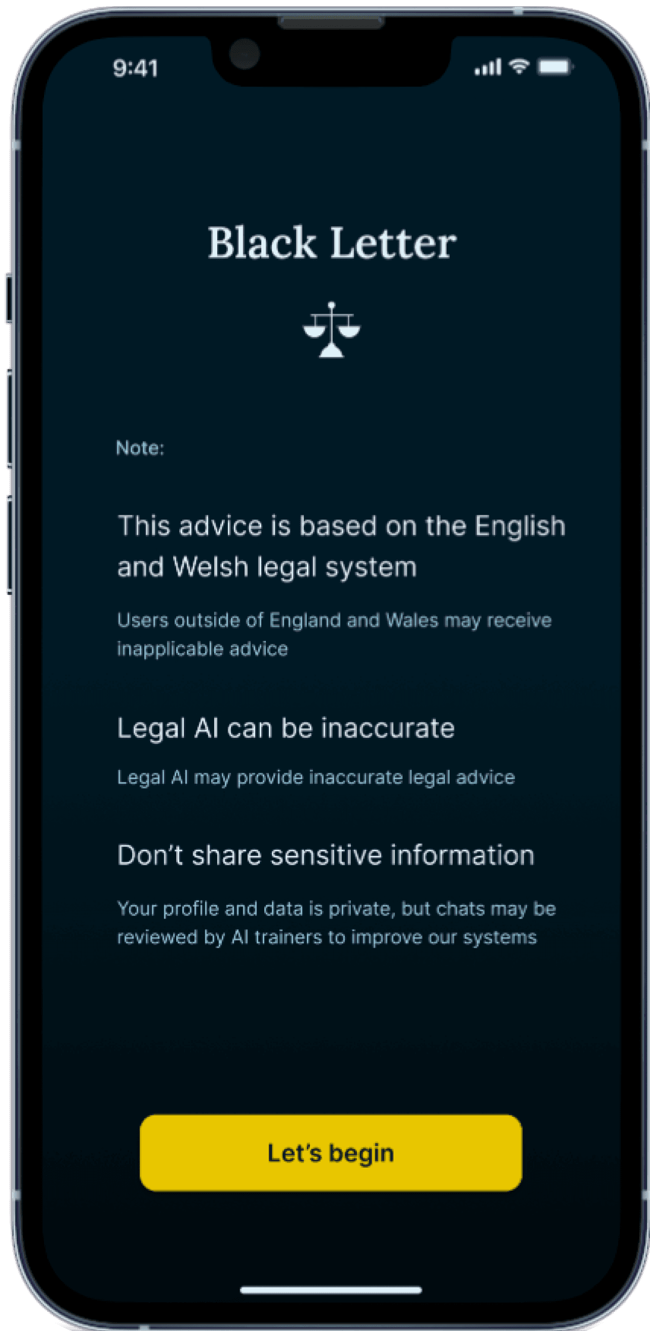
A name to convey authority and trust
I named the app "Black Letter" to reflect its purpose and structure. This term, familiar from my studies and work as a legal recruiter, refers to well-settled legal principles. It captures the app's aim to provide clear and reliable legal information, helping users understand their rights and navigate the complexities of the legal system.
"Black Letter" conveys authority and trustworthiness, emphasising the app's commitment to accurate legal insights and connecting users with the right support.


2. Designing


User testing on information architecture
After sketching screens, mapping key interactions with a user flow diagram, and developing a sitemap to define Black Letter’s structure, I created wireframes.
To validate their effectiveness, I conducted a moderated remote usability test with five non-legal users (friends and family) to assess the app’s information architecture before refining the UI.
Despite potential biases, the feedback provided quick and valuable insights. Users highlighted the necessity for settings to be easily accessible at all times. They also sought clarity on whether law firms would need to pay to be featured on the app. Additionally, there was a clear preference for the structure of AI responses. Users wanted the legal area to be presented first, followed by statutory information, a summary of the legal area, and AI-generated recommendations last, with a call to action to access professional support.


Trustworthy and readable typography pairings
I selected Lora for headings and Inter for body text to blend professionalism with accessibility. Lora’s serif elegance conveys trust, while Inter’s clean sans-serif design ensures readability. This pairing enhances clarity and user experience, catering to diverse users.
I also developed a typeface system with defined font sizes for headings, body text, and labels, ensuring alignment with usability standards to promote clear, consistent, and effective communication.
A professional and reassuring colour palette
I drew inspiration from professional services apps to create a sleek, modern aesthetic. The dark UI reduces eye strain, with deep blue symbolising law and authority.
I focused on high contrast for accessibility, using gold to highlight key interactions and off-white text to improve readability.
This colour palette reinforces Black Letter’s identity: dark blue conveys professionalism and trust, while gold adds a touch of luxury, creating an app that’s both reliable and aspirational.


On-brand loading animation
I designed a simple logo that also serves as a loading animation during response generation or when transitioning users from Black Letter to a law firm’s website.
I kept the design simple to adhere to the Law of Prägnanz, which states that people tend to perceive complex images in their simplest form. This principle is crucial here, as a clean logo is easily recognisable and memorable, enhancing the user experience.
The logo features a scale that tips from side to side as the screen loads, subtly reinforcing the concept of justice. This motion suggests that the balance is tipping in favour of the user, instilling a sense of empowerment and trust as they await legal guidance.
Professional imagery
I chose photography over illustrations to build trust and approachability. These visuals humanise the legal experience, helping users feel comfortable navigating legal matters. For firm and charity images, I opted for their logos to establish professionalism and credibility, reinforcing users' confidence in accessing reliable legal support.


Delighting the user with motion
With my visual system in place, I scaled up in fidelity before moving on to prototyping.
To create an interactive user journey, I used Smart Animate to incorporate engaging motion elements, including loading animations, hover and selected button states, email notification drop-downs, and chat answer loaders. The move-in/move-out feature as users navigate deeper into the app, for example, going into the prompts library, adds depth, ensuring seamless navigation for users. Most animations were timed at 400ms to align with UX principles, enhancing the overall experience.
3. Testing and improving


A broader demographic?
With such an emphasis on legal information and detail, I realised the app could serve a broader demographic. It could benefit legal professionals and law students studying specific areas or checking statutes for key sections. Additionally, it could aid business owners and freelancers seeking guidance on contracts, employment law, and regulations.
High fidelity testing round one: Demographic exploration
To explore my theory, I conducted usability testing with 16 users across the three demographics: individuals with no legal education, business owners, and law students and legal professionals. Participants either observed a prototype walkthrough or explored independently while I recorded feedback.
Overall, feedback was positive, with users praising the design and visual style as well-suited for the legal sector.
However, alongside some additional improvements, testing highlighted the importance of focusing on individuals without a legal background, as business owners typically already have reliable external legal support. Legal professionals noted that few apps provide a user-friendly breakdown of key statute sections, but they suggested that distinct labeling for academic versus practical legal areas could confuse users. This feedback indicates that the app may need to prioritise one demographic over the other to enhance clarity and usability.
Test limitations included restricted non-verbal feedback due to most sessions being conducted remotely, and potential biases, as all participants were friends or family. While more unmoderated sessions could have provided broader insights, remote constraints limited this opportunity.
Reduce technical language to enhance clarity.
Refine AI chat prompts to build on previous questions.
Create firm filters alongside referral scheme for a better user experience.
Provide downloadable statute information.
Include clear disclaimers regarding the limitations of AI.
Incorporate the option to scale text for larger readability.
Design a website version of the product for less technical users who may find this format more intuitive.
Shift practice area names away from academic terminology to focus on practical, customer-facing legal terms.


Round two: The correct demographic, but an unclear referral scheme
To ensure the changes were effective and that Black Letter caters to users of all ages within the non-legal background demographic, I conducted a second round of testing with five users aged 24 to 68. This group included both new and returning users, enabling feedback on improvements and previously identified pain points while also providing fresh insights into usability issues.
I combined moderated user testing with a survey to gather both qualitative and quantitative feedback. Conducted primarily in person, users navigated the app on a phone for a realistic experience. Individual sessions minimised bias, reduced peer pressure, and encouraged focused observation.
Feedback was predominantly positive, particularly regarding features like text scaling for older users. The app was praised for its intuitiveness, helpfulness, and visual appeal, making it well-suited to the demographic. Survey results indicated strong ratings, with Black Letter's interface scoring 4.3/5 and the app receiving a perfect 5/5 for overall value. Therefore, the feedback indicated significant progress since the first round of high fidelity testing, confirming that the app provides a supportive and professional experience for individuals without legal backgrounds.
However, users noted the need for clearer context around the referral scheme, as some confused it with the onboarding process. Users also suggested a more intuitive name for the referral scheme than "Firm Search," as the terminology could cause confusion between the firm and charity directory, and the referral process. With this confusion, users preferred to use the classic search filter, despite less tailored results.


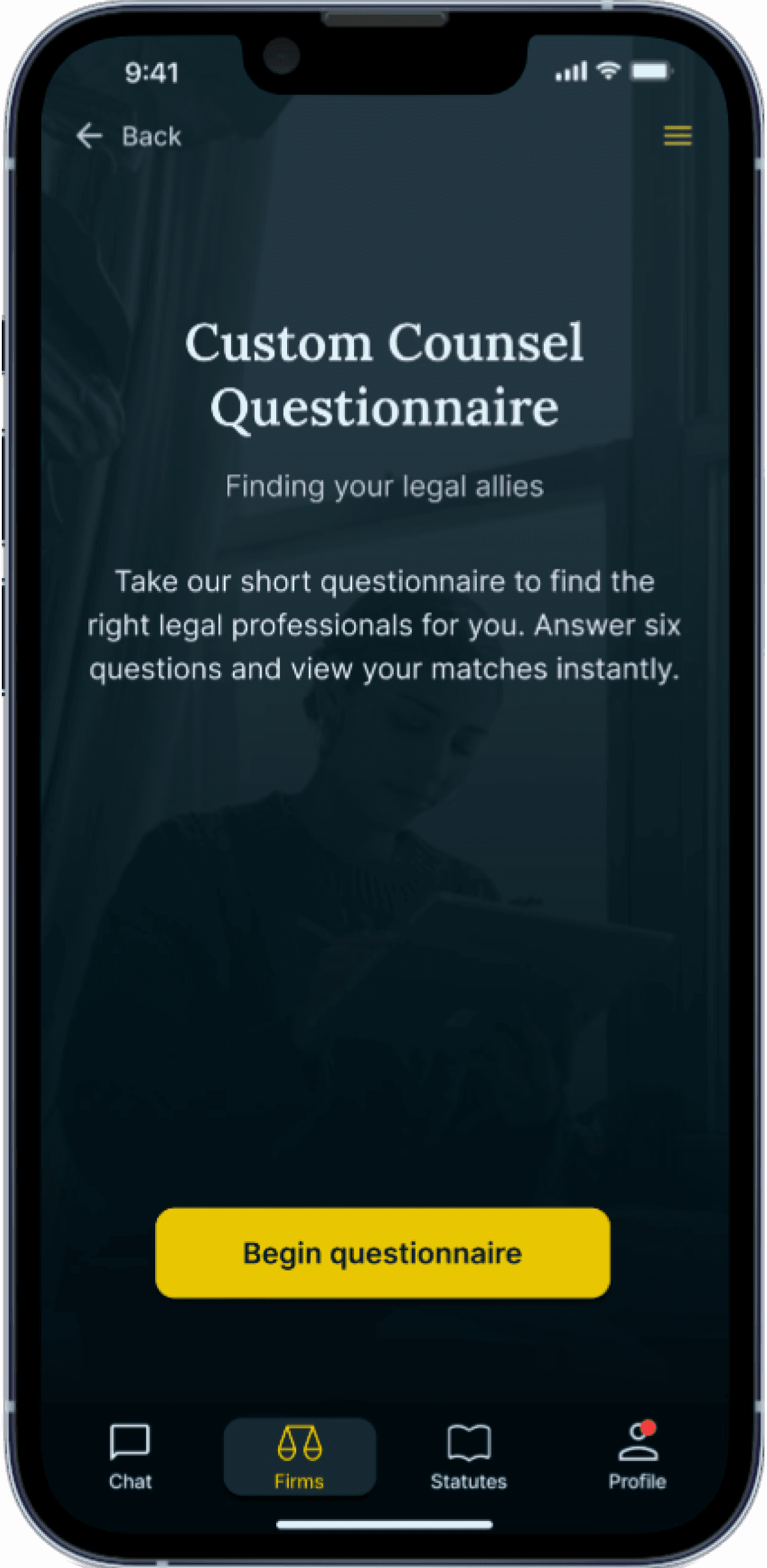


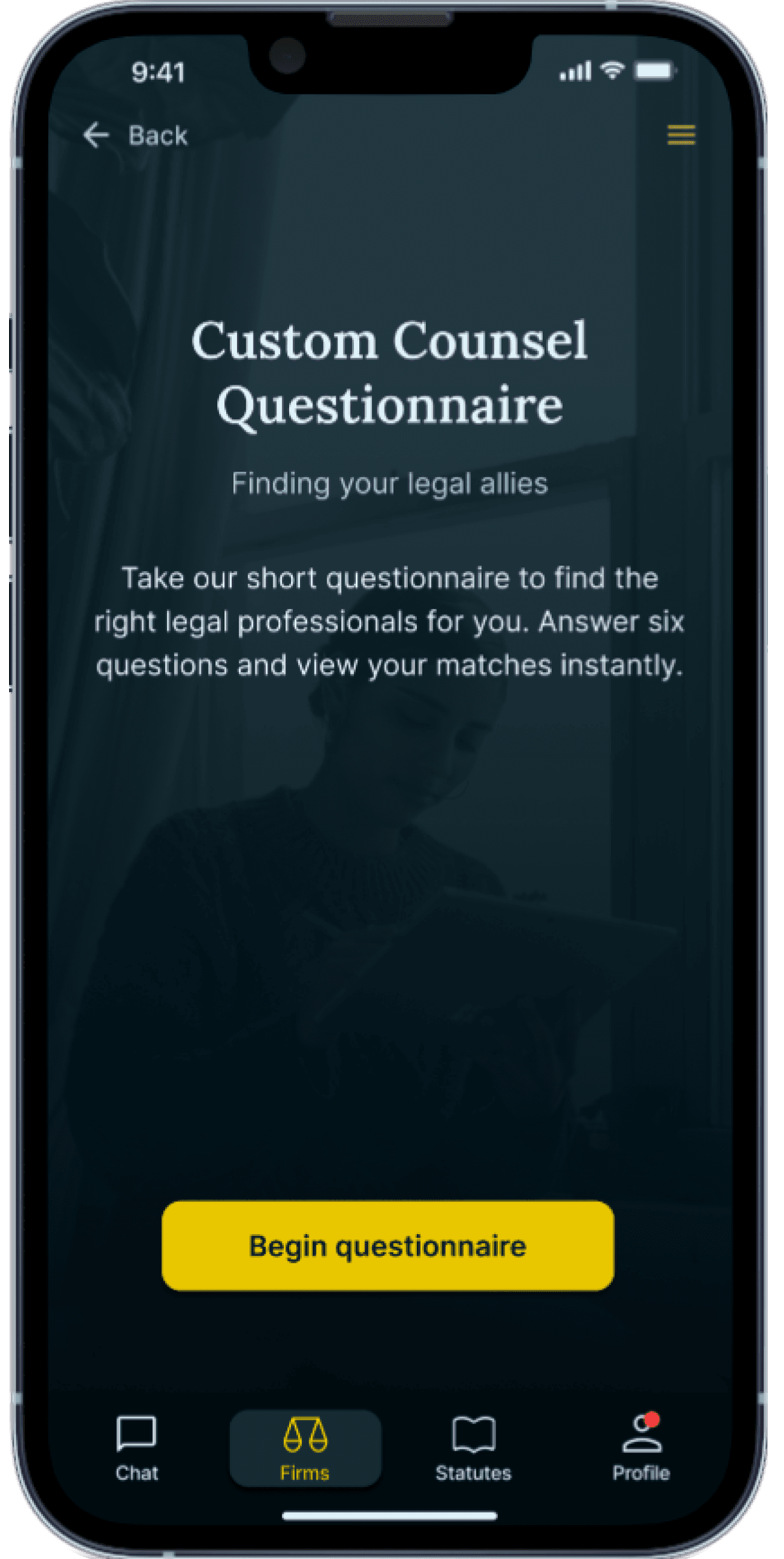
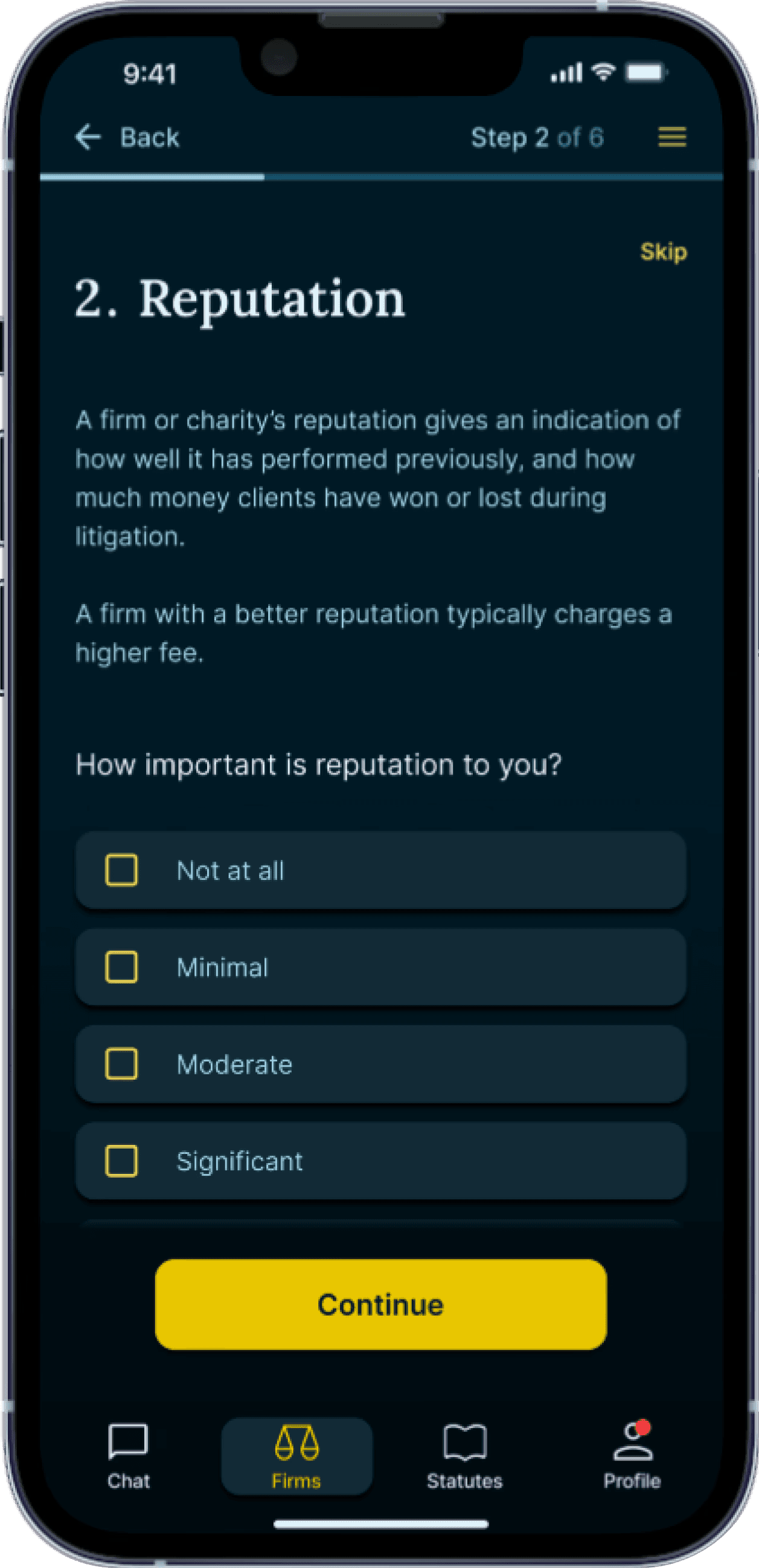
A renamed and clarified referral scheme
To clearly distinguish the referral scheme from the firm directory and convey that users are personalising options, I enhanced its branding. I renamed it "Custom Counsel Questionnaire", integrated prominent calls to action, and added a relevant image similar to the onboarding section, ensuring the title was prominently displayed to reinforce its purpose.
To improve usability, I modified the interface to include progress indicators, such as numbered steps, and introduced question titles like "Reputation" for context. These enhancements clarify the user journey and create a more intuitive experience, empowering users to navigate the questionnaire with confidence.
Final round of testing: Confirming the referral scheme's benefit
After implementing these changes, I conducted a brief third round of testing on the referral scheme with two users who had previously faced difficulties and were less technologically inclined.
During individual sessions, these users noted a clearer distinction between the onboarding areas and the revised questionnaire, finding it intuitive and highly useful for narrowing down support options. They preferred it to the basic search filter, highlighting the effectiveness of the improvements.
Final result
Validated through thorough research and extensive testing, Black Letter addresses critical pain points, such as confusion about legal rights and the challenge of finding appropriate legal representation. The app combines a visually appealing, intuitive interface with key features, including an AI chatbot, statute library, and a law firm and charity directory with a tailored referral scheme.
These elements provide clear, accessible pathways for users to navigate legal inquiries and connect with the right professionals, and the profile section allows users to save important information for easy access. By transforming a complex legal process into a streamlined, user-friendly experience, Black Letter empowers individuals, like those I volunteered with, to confidently assert their rights.
Guided by users at every stage.
Resolving a challenge that other apps ignore.
Harmonising usability with design choices that engage users emotionally.
Key learnings
Prioritising core needs to avoid scope creep
Initially, I expanded the product's demographic to include business owners, legal professionals, and law students, seeing the statute library as a valuable resource for a wider audience. However, user testing results reinforced that focusing on individuals with no legal background was more effective. Prioritising their core needs—understanding rights, finding laws, and accessing legal help—helped avoid feature creep and ensured clarity.
The value of multiple rounds of testing
Early testing revealed confusion about legal terminology, while later rounds revealed uncertainty in the referral scheme. Multiple rounds of testing allowed me to refine explanations, improve the UI’s clarity, and ensure that users could confidently take action based on the app’s recommendations.
Balancing automation with user control
Users were hesitant to rely entirely on automated referrals. Testing showed that allowing them to review and filter recommended legal professionals increased trust. This balance between AI-driven suggestions and user control improved engagement and confidence in the platform.
Next steps and future improvements
To advance Black Letter, I would want to conduct further user testing with unbiased participants to ensure valuable, more accurate insights before launch.
I would develop a marketing strategy to highlight the app’s unique features and accessibility options and implement a feedback mechanism post-launch, such as reviews or in-app surveys, for continuous improvement.
Clearly defining the target demographic from the start will be essential to ensure efforts are focused on meeting the specific needs, goals, and preferences of the users who are most likely to interact with the product or service.

