TopFlight Digital
Revolutionising brand presence for a software development agency


How can a website build trust and engagement?
TopFlight Digital’s website generated fewer than four leads per year, relying entirely on personal connections. Even then, it failed to showcase expertise or build credibility.
The client prioritised brand presence over direct conversions, so I was brought in to design a clear, credible website that served as a strong calling card for connections, rather than focusing directly on lead generation.
Beyond retaining the logo and branding colours, I had full creative control.
The solution is usability, appeal, and branding
User research and testing were out of scope, so I ensured stakeholders understood that the lack of user validation meant operating on assumptions, while highlighting the importance of future validation. To best overcome this challenge, I prioritised extensive research, combining quantitative analysis (engagement metrics, competitor benchmarking) with qualitative insights (personas, journey mapping, best practices). This informed design decisions and highlighted the need for clearer positioning, stronger market differentiation, enhanced credibility, and mobile-first optimisation, prioritising users like CEOs, heads of digital, and product owners.
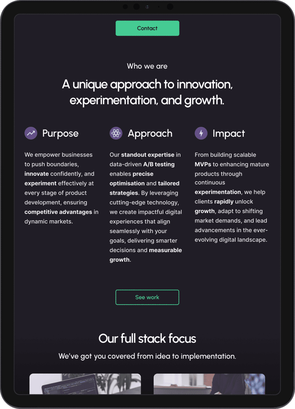
The final redesign improves clarity, showcases TopFlight’s unique value, integrates trust signals and case studies, and ensures a seamless experience across all devices. It aligns with industry standards, reinforces TopFlight’s strengths, and serves as a powerful calling card, ultimately increasing brand presence, which will in turn increase conversion rates.
1. Research
Calls to action and valuable content
I began by examining metrics to establish a data-driven approach. Metrics showed the website averaged 40 sessions per month, including team visits. While most users navigated beyond the homepage, conversions remained low—only averaging one per quarter.
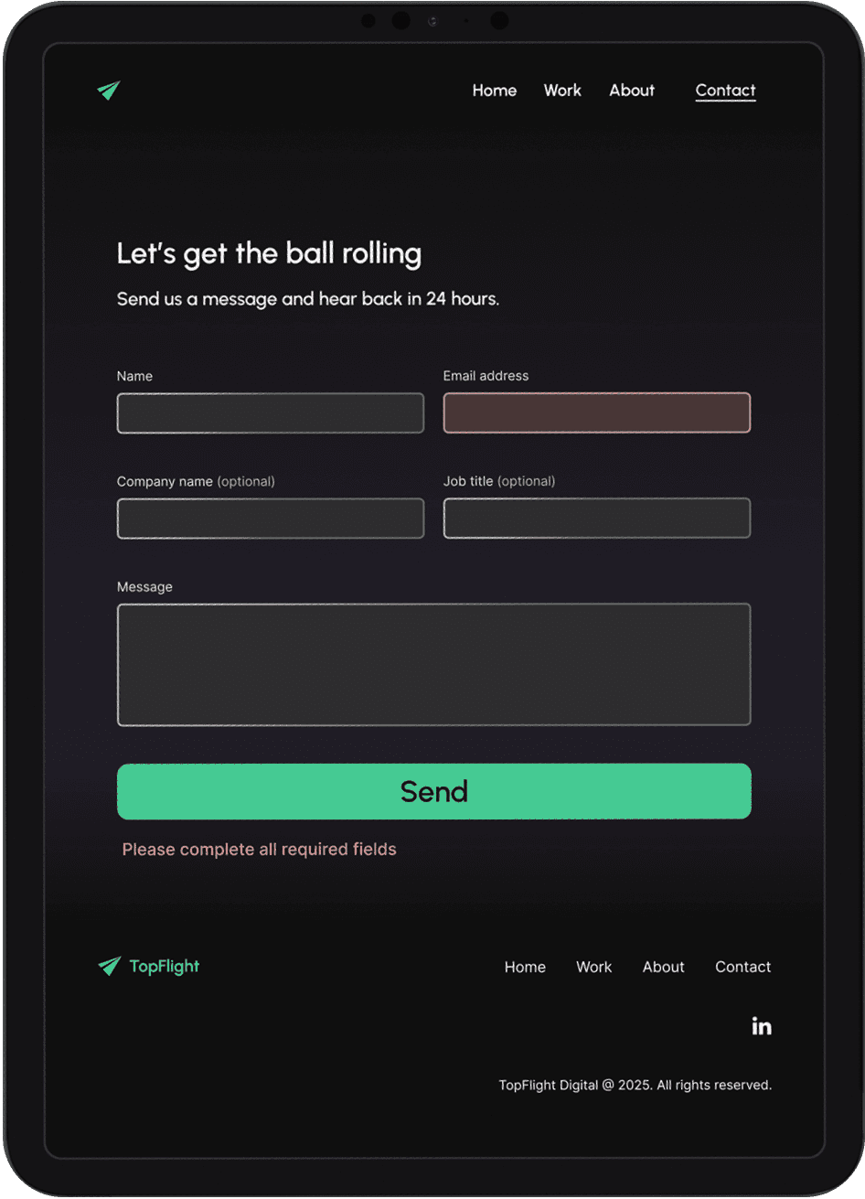
Although lead generation wasn’t the primary focus of the redesign, this highlighted the need for a more informative homepage and valuable site-wide content. Forms and calls to action required improved visibility and appeal, while content needed a clearer visual hierarchy.


Demonstrating a competitive edge and technical expertise
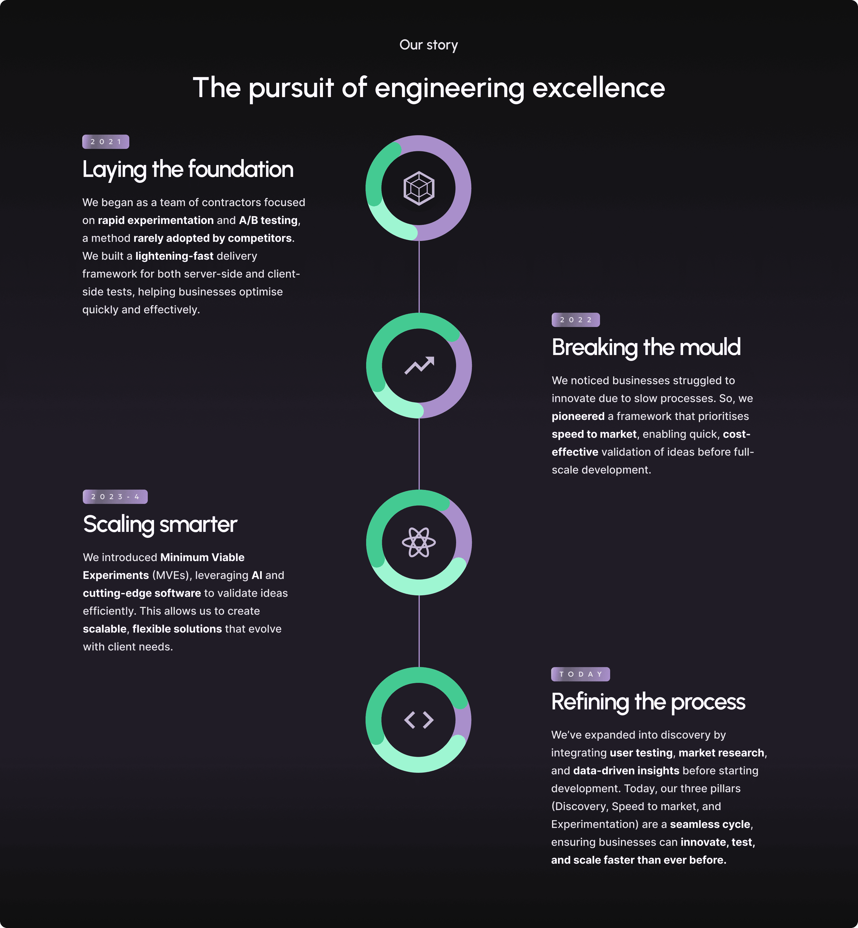
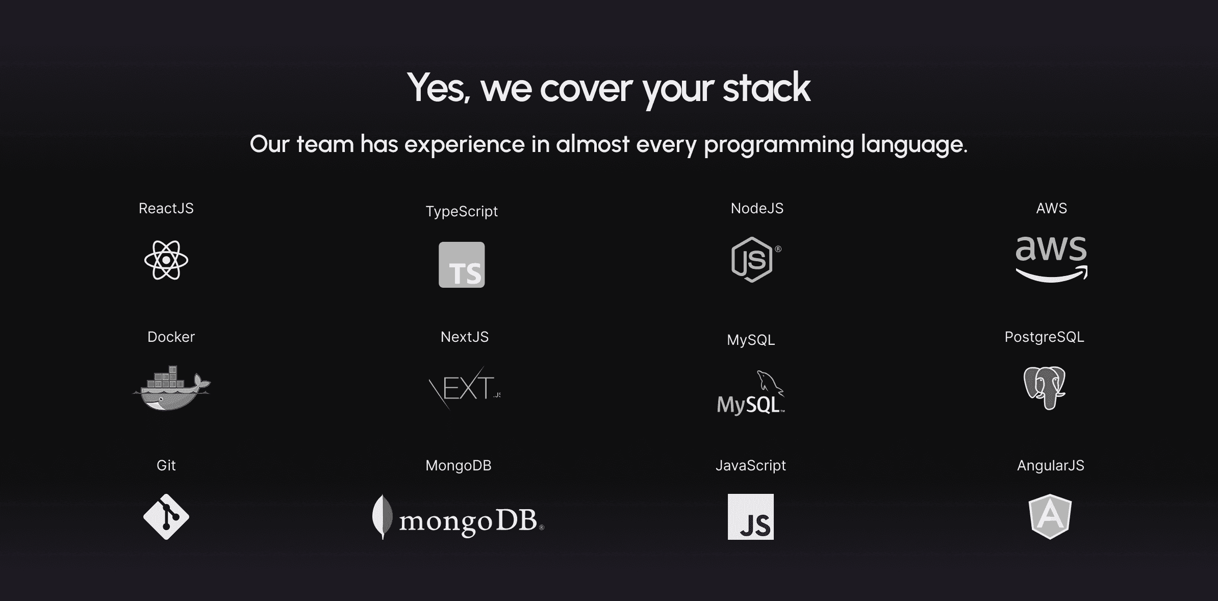
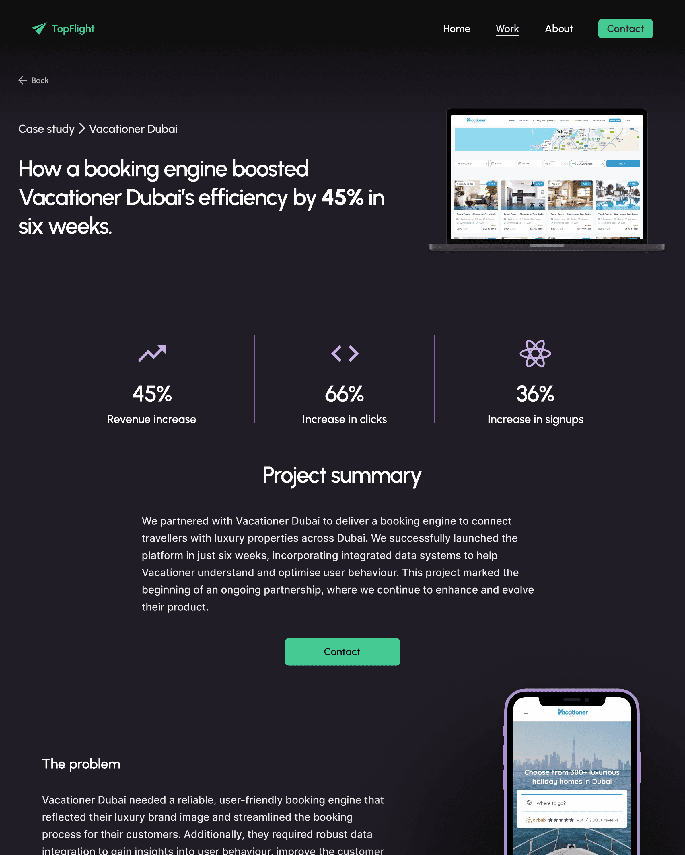
To establish industry best practices and identify potential market differentiators, I conducted a competitive analysis. This revealed the need to highlight TopFlight’s unique strengths, such as its focus on A/B testing, to stand out in a competitive market.
A SWOT analysis further emphasised the importance of showcasing TopFlight’s technical expertise and innovation-driven culture, positioning the company as a partner for both early-stage startups and mature products seeking optimisation and growth.
SWOT analysis
Strengths
Specialisation: Focus on rapid software development and MVPs appeals to startups and innovation-driven businesses.
Technical proficiency: Skilled in cutting-edge technologies like ReactJS, AWS, and NodeJS.
Innovative culture: Positioned to support innovation and experimentation.
Weaknesses
Niche market focus: May have limited appeal outside early-stage or tech-driven companies.
Limited client focus: May need more emphasis on industry-specific case studies.
User experience: Potential for improvement in navigation and design aesthetics.
Opportunities
Growing demand for digital solutions: Increasing need for fast, scalable development across industries.
AI and automation: Potential to expand services in AI-driven solutions.
Threats
Intense competition: Many competitors offer similar services with rapid development.
Technology disruptions: Fast-paced changes in development frameworks could require constant adaptation.
Meeting and beating industry standards
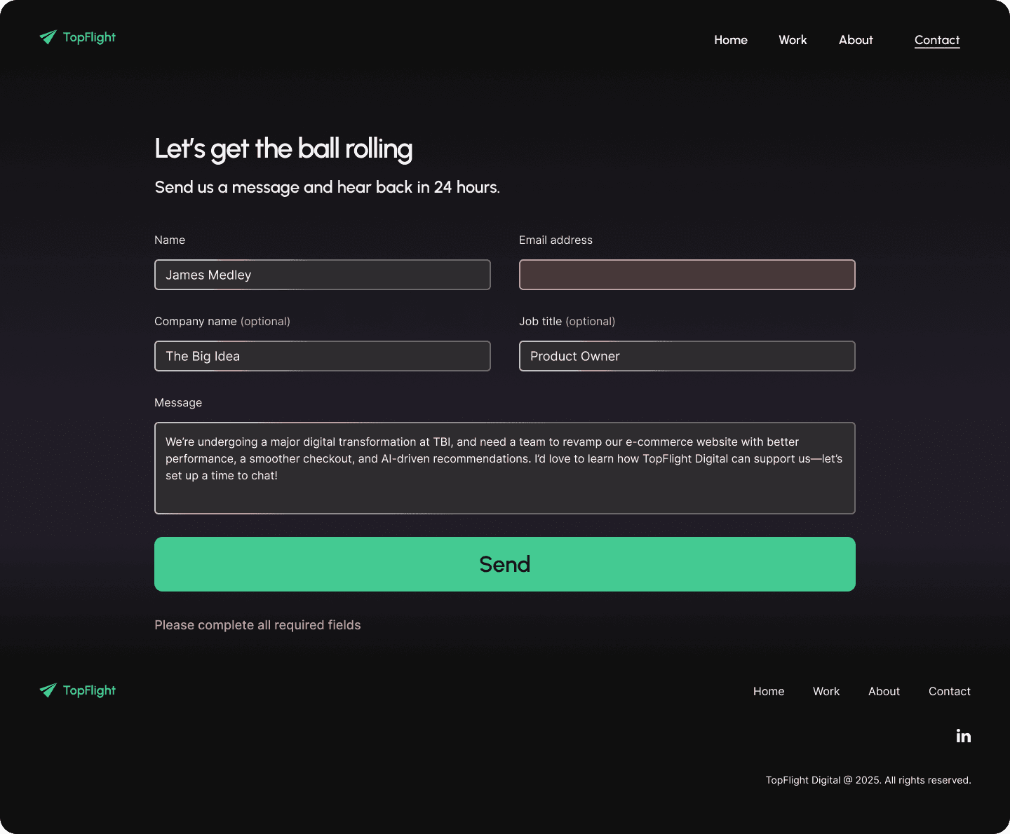
By analysing competitors' strengths, I identified the need for a dedicated contact page to provide clear access for potential clients. Analysing competitors shaped the information architecture across all pages, helping define the language style, content structure, and alignment with user expectations for image style, navigation, and page length.
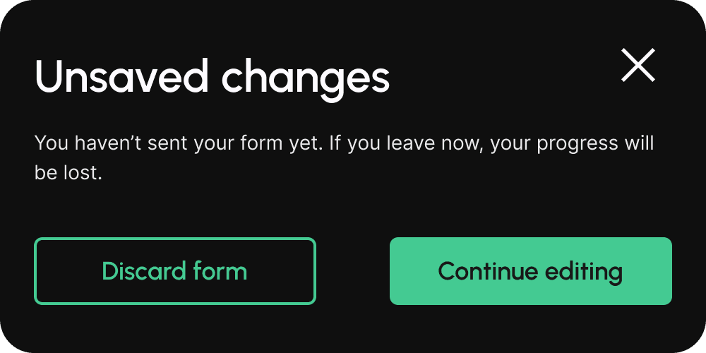
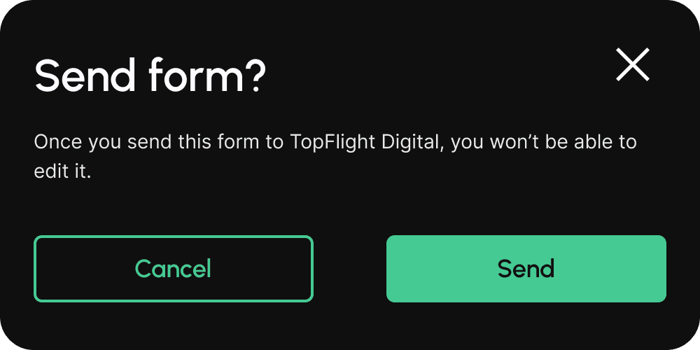
Additionally, I noted a usability flaw in several competitors' contact pages: they lacked modals to alert users before exiting an incomplete form or confirming details before submission. Failure to address this could result in lost progress or incorrect submissions, leading to user frustration and lower conversions. As such, it was essential to incorporate modals into my designs.
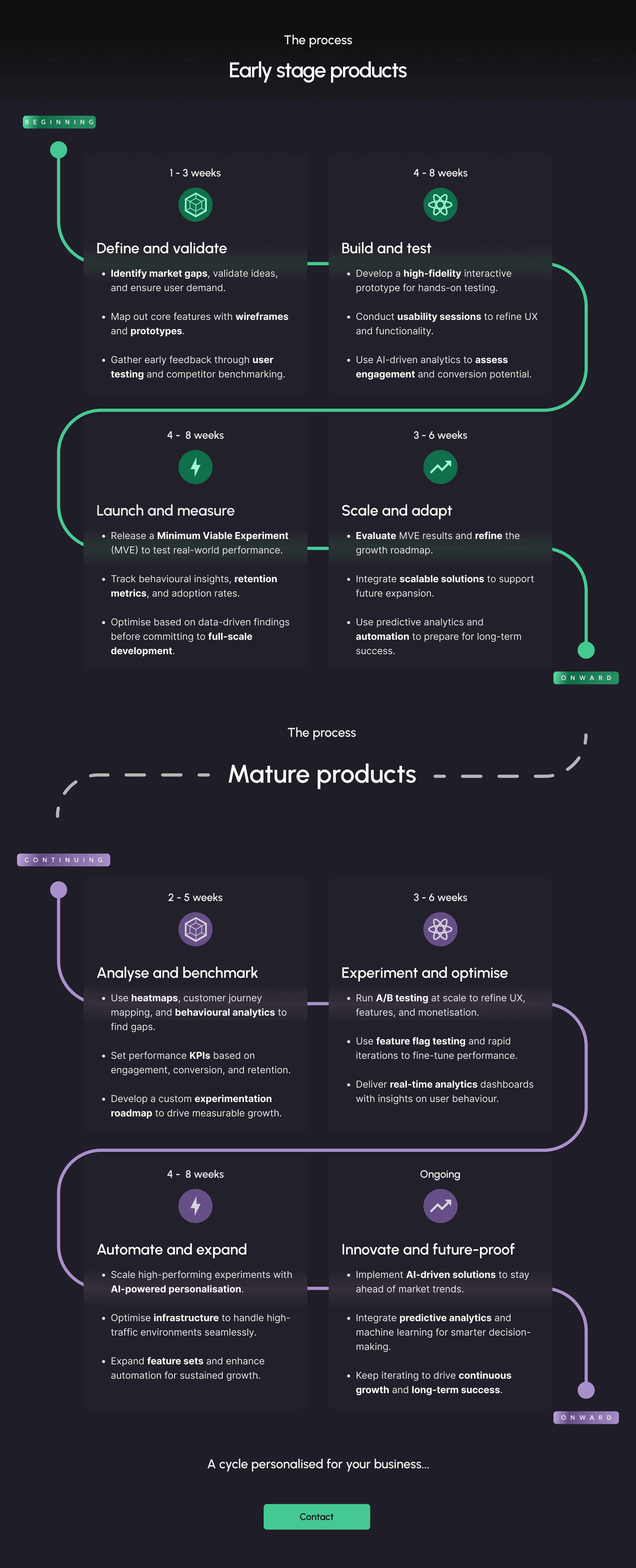
Outlining services, timelines, and processes upfront
To further address the lack of user research and testing, I created a user persona and user stories to foster empathy and guide the design process.
These revealed the need for a website that clearly and concisely communicates strategic value, focusing on tailored solutions and an efficient, mobile-friendly design. Clients like James prioritise a strong first impression that aligns with their business goals, seeking partners who offer custom solutions and a well-defined project process.
As a result, it was essential to break down process timelines with clear deliverables and provide fully transparent offerings.

User persona findings
James Medley - Product Owner
35 years old
Moderate tech proficiency
Goals
Frustrations


Trust signals and industry-specific case studies
Despite this evidence, I ensured the stakeholders were aware that, without real user validation, I was operating on assumptions and that further validation from real users might be necessary in the future. To help mitigate this, I suggested additional empathy-building research, such as journey mapping, which the stakeholders agreed to.
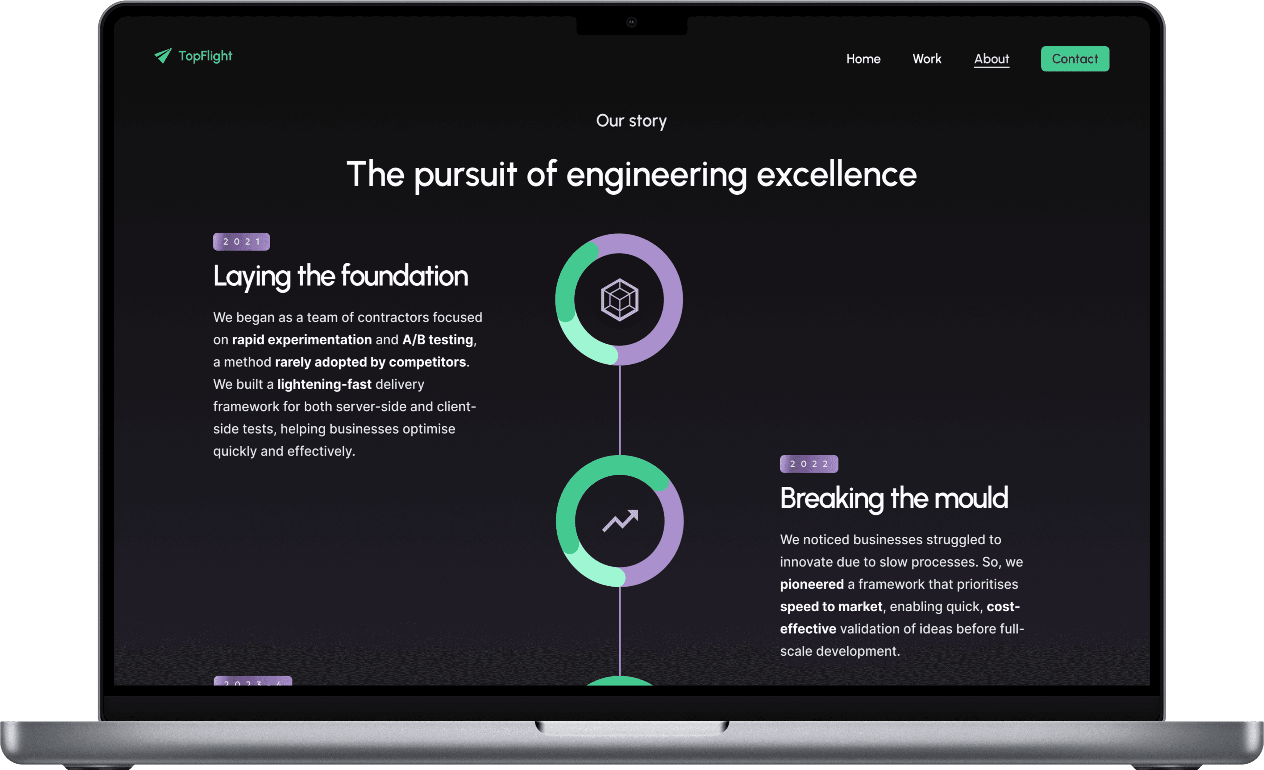
Creating a journey map highlighted the importance of showcasing industry-specific case studies and a clear working process, focusing on relevant information for fast-paced clients.
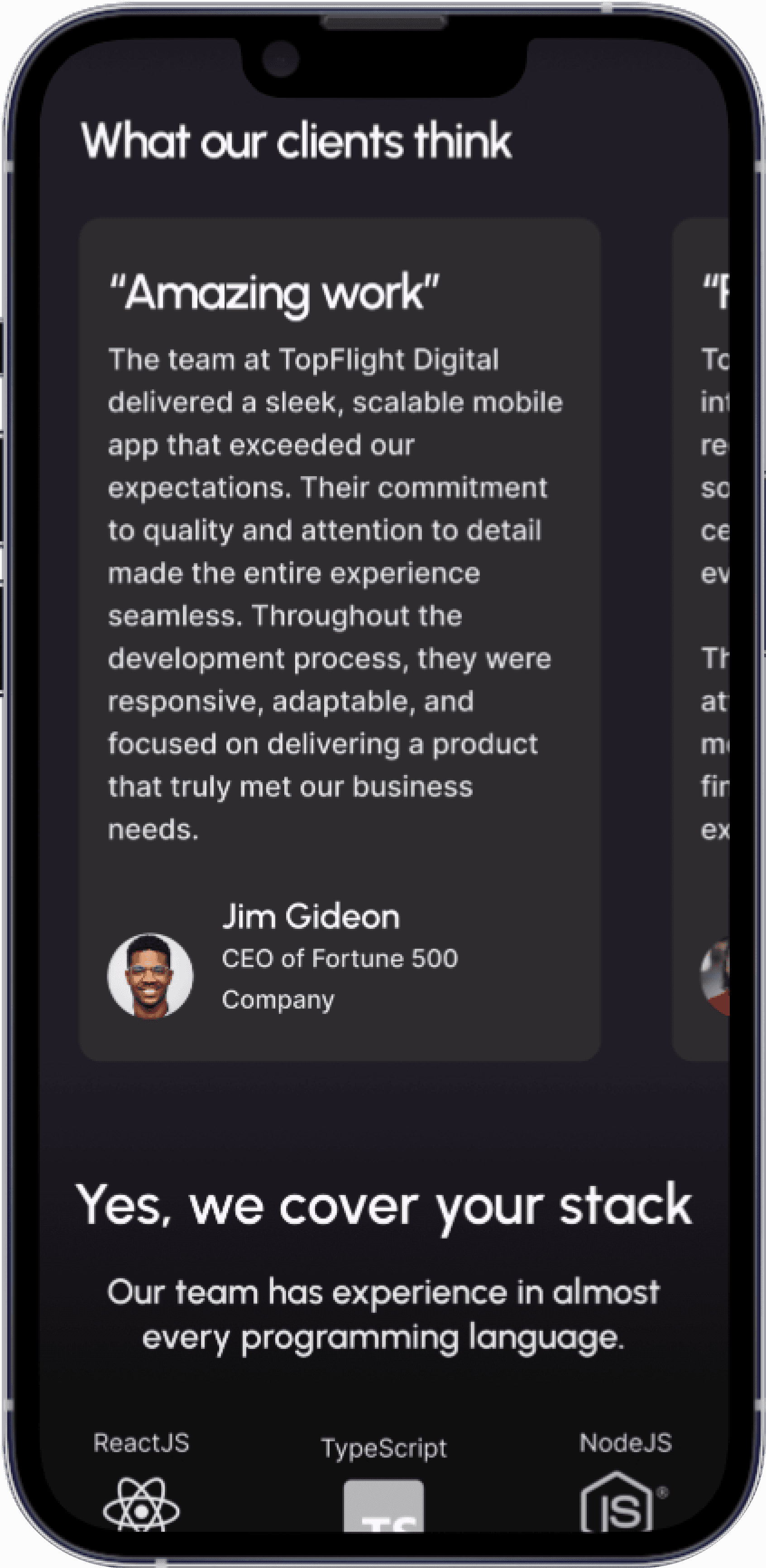
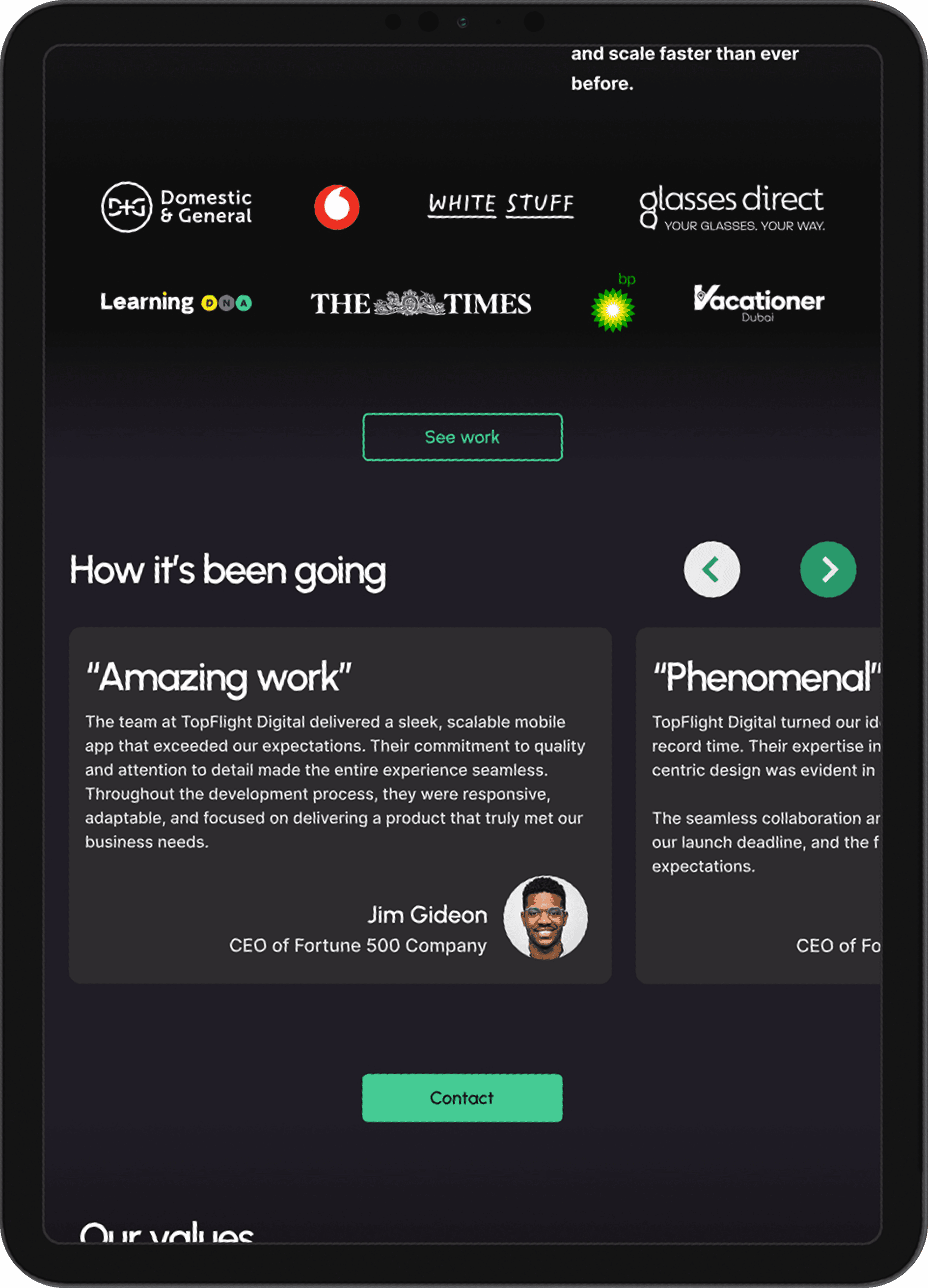
It also demonstrated the need for client logos, testimonials, and success metrics to build trust, while clear CTAs with reassuring messaging about flexibility, scalability, and on-time delivery will guide users and instill confidence in TopFlight's reliability.
Journey map findings
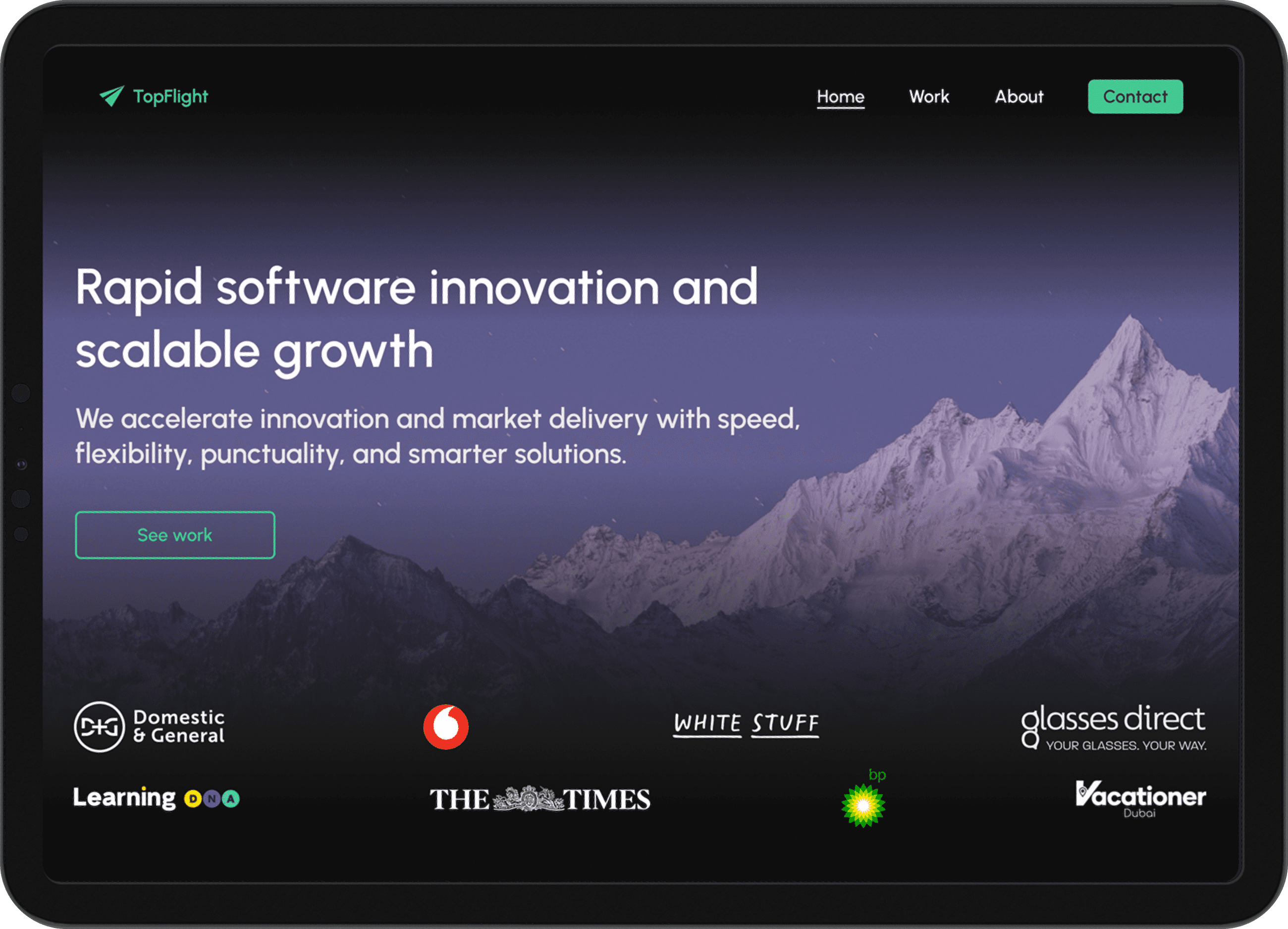
Use client logos, testimonials, and specific success metrics to build credibility and trust.
Feature more relevant, industry-specific case studies (e-commerce, SaaS, digital transformation).
Simplify the homepage with a stronger focus on clear value propositions, specifically optimisation and rapid delivery.
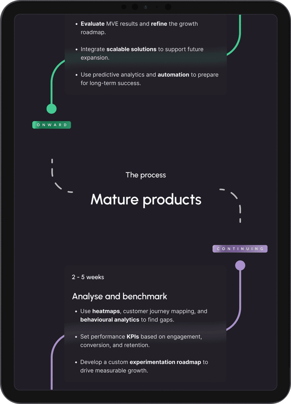
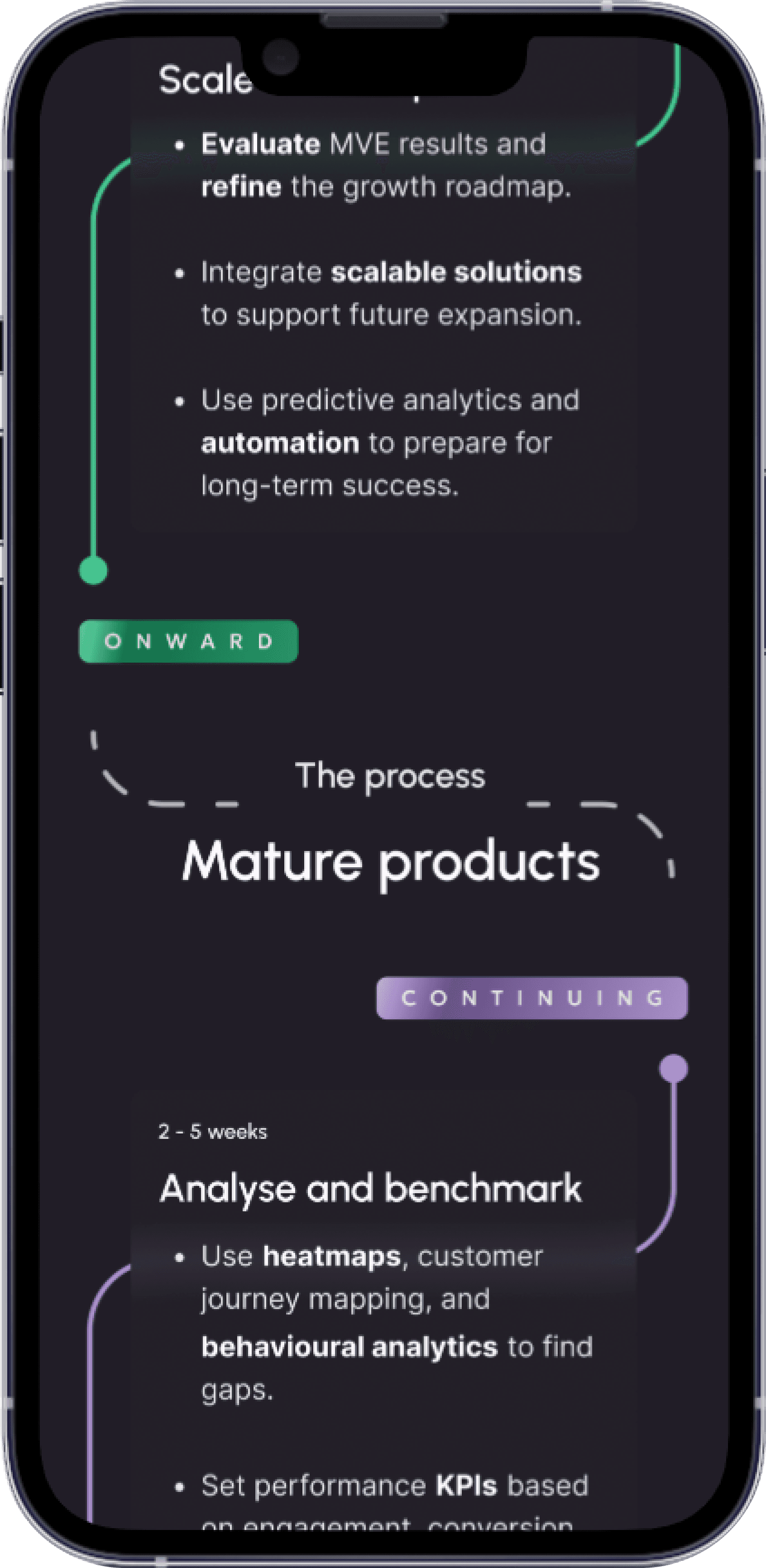
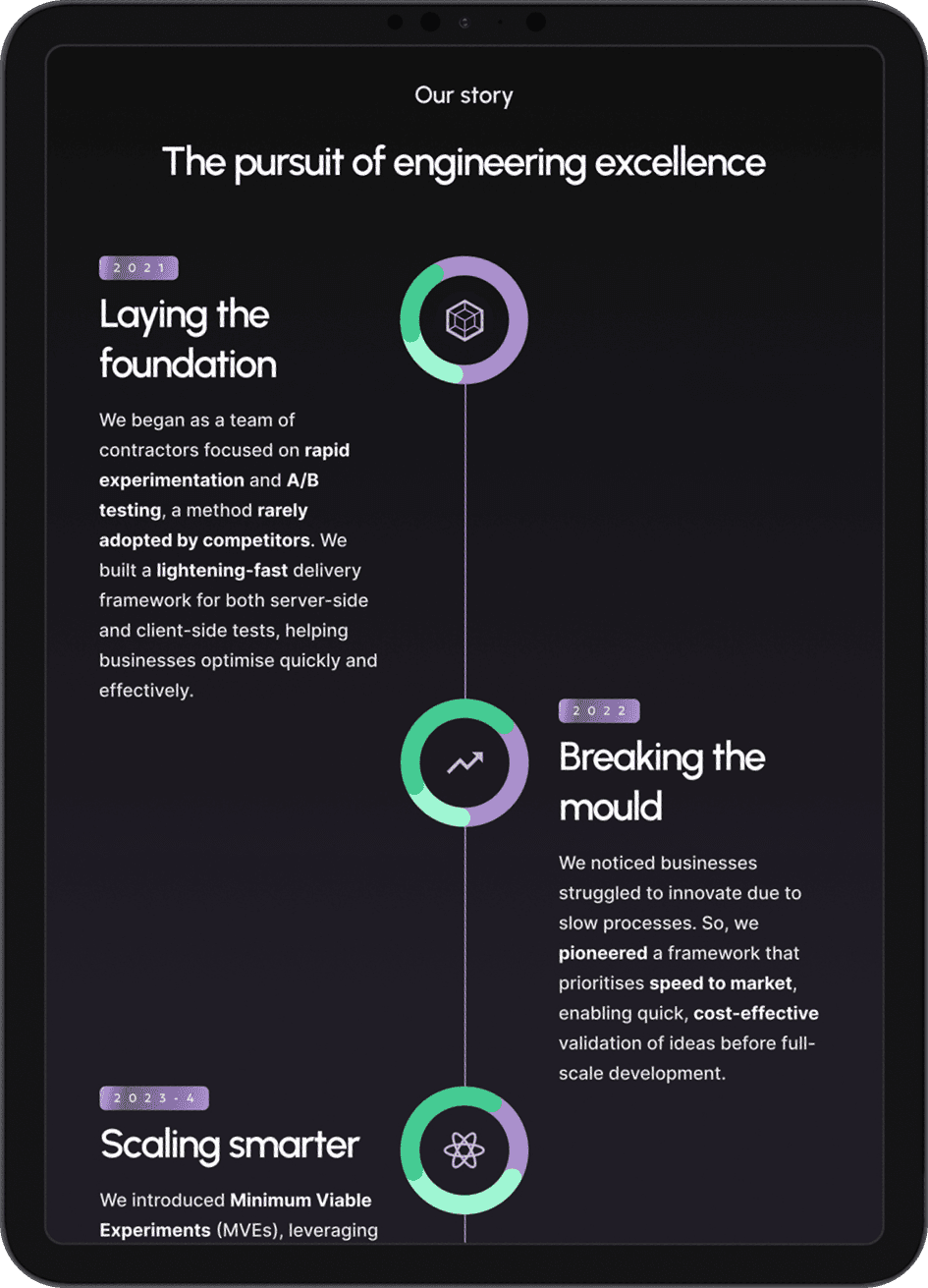
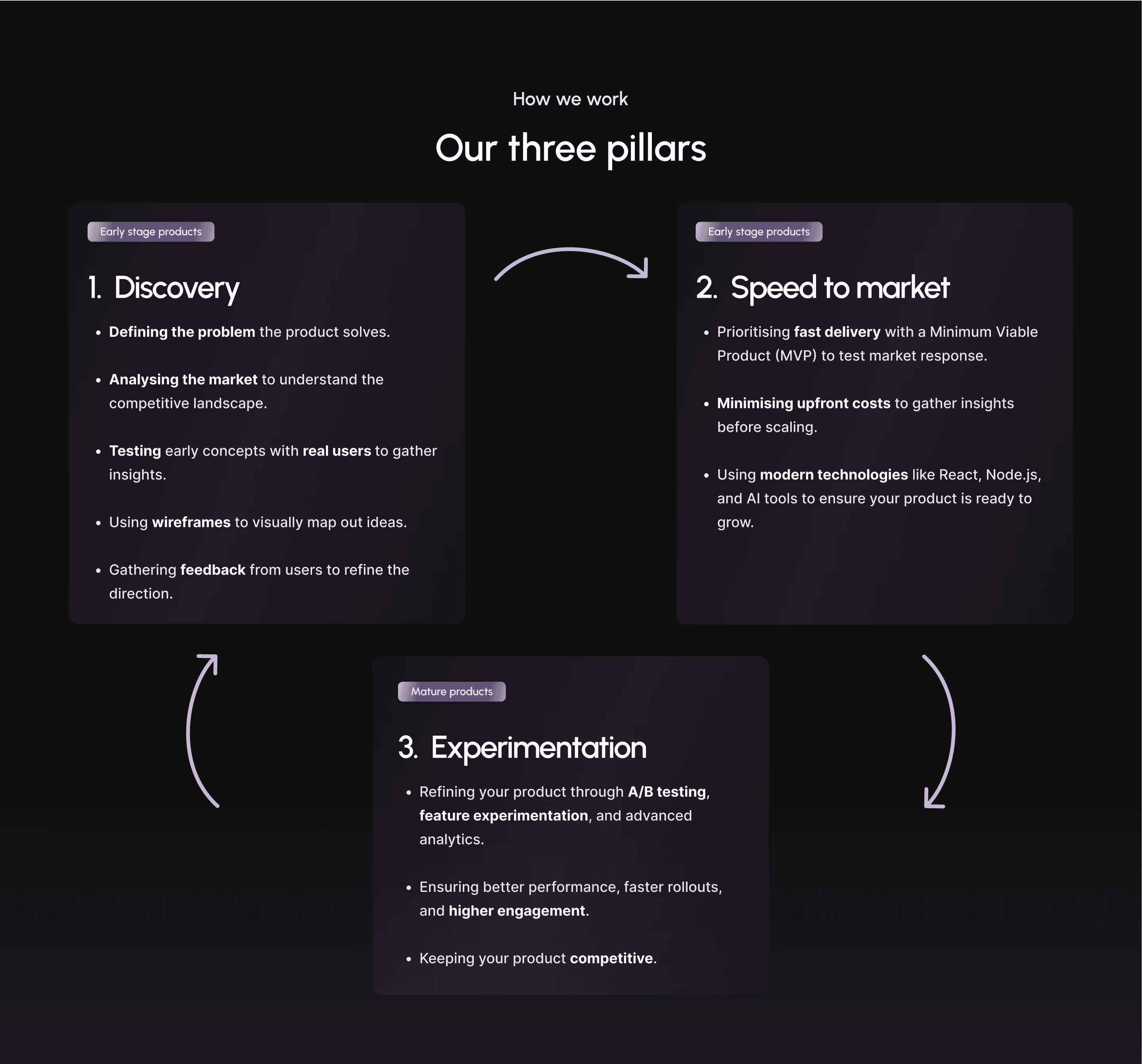
Introduce a diagram or visual timeline on the homepage that communicates the service scale from MVP to optimisation.
Reorganise content to prioritise the most relevant information for fast-paced clients like James.
Create sense of the company’s mission and team culture.
Include a clearer, more detailed overview of the working process (e.g., MVP to optimisation timelines).
Use clear, prominent CTAs that guide James to the next steps in the sales funnel.
Reassure James with clear messaging on TopFlight’s flexibility, scalability, and commitment to on-time delivery.
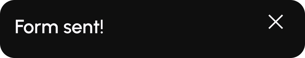
Provide immediate next steps after form submission (confirmation email, calendar booking, etc.).
2. Informed results
Highly functional, visually engaging and strategically structured
The redesign of TopFlight Digital’s website successfully addresses the core issues identified during the research phase, focusing on building credibility and showcasing expertise. By enhancing the clarity of the brand’s value proposition and integrating trust signals, such as case studies, client logos, and testimonials, the new website positions TopFlight as a reliable, expert partner.
Though user research and testing weren't possible, I used extensive research, personas, and journey mapping to inform the design and address likely user needs. I kept stakeholders informed of the limitations, clarifying that future testing could refine the user experience.
The solution aligns with industry best practices while meeting the needs of fast-paced clients, emphasising mobile-first design, clear calls to action, and a streamlined process. The improved user journey, with transparent service timelines and deliverables, ensures a seamless experience across devices and strengthens the overall brand presence.
TopFlight Digital now has a powerful digital calling card that fosters trust, instills confidence, and will ultimately contribute to higher conversion rates.
Credible, professional, informative.
Differentiating in a highly competitive market.
Perfectly functional across multiple devices.
3. Reflections and future considerations
Key learnings
Research-centred approach
While researching and testing with users is ideal, prioritising user needs and behaviours can still be achieved through alternate research methods.
Clear messaging and content strategy
In addressing issues of content hierarchy, creating compelling value propositions and building credibility, consise and strategic language is imperative.
Mobile-first and responsive design
Flexible grids, adaptive typography, and considered layout adjustments were imperative to create a consistent, user-friendly experience on all devices.
Next steps and future improvements
Conducting usability tests and monitoring analytics to validate design decisions and gather insights for further optimisation would be an ideal next step, as the designs, while informed by thorough evidence, are still ultimately operating on assumptions.
Refining the conversion strategy would be beneficial, as exploring additional ways to optimise calls to action for higher user engagement could drive conversions and ensure the website meets its business objectives.
Additionally, including blogs and articles would help differentiate the brand and further build credibility by providing valuable, industry-specific insights that demonstrate thought leadership.