TopFlight Digital
Slashing the risk and cost of redesigns—in just 3 weeks


A very tight deadline
TopFlight Digital hired me to design a minimum viable product (MVP) for an internal project—OptiPilot, a Chrome extension that uses AI to scan websites and instantly suggest high-impact design improvements, cutting the time, cost, and risk involved in website optimisation. The target users included product owners, UX researchers, CRO consultants, marketers, and small business owners.
The premise of Optipilot was that users would input details about their website and the specific page they wanted to analyse. The extension would scan the page, generate insights, and provide a downloadable report. Users could then adjust their input and run new scans to refine the results. The platform’s revenue model would be based on purchasing 'scan' credits.
The challenge was to create a visually distinctive yet intuitive product that balanced engagement with usability, all within a tight three-week timeline.
Given full creative control aside from a few low-fidelity page designs, which established the wording, I prioritised rapid prototyping and user testing over extensive research. This approach helped minimise assumptions and validate decisions through user feedback, ensuring a practical, user-centred design.
Balancing speed with user-centred design
By rapidly prototyping to industry standards and using AI heatmaps, user testing, and a user persona, I designed intuitive screens that made AI-generated suggestions clear and actionable. The result reduces reliance on lengthy manual processes, saving time and lowering costs.
I validated the need for non-technical language by championing thorough user testing, even when stakeholders initially preferred technical terminology. The final designs simplified complexity, ensuring accessibility for the target demographic.
When a last-minute sizing change required quick adaptation, I stayed user-focused, refining the interface without compromising clarity or function. The outcome was a sleek, engaging design that balanced usability with ease of use.
"We had the pleasure of working with Sarah on OptiPilot, which was a fantastic experience. Her creativity, attention to detail, and design expertise brought our vision to life in a way that exceeded expectations. We couldn’t be more pleased and highly recommend her talent."
- Vasilika Traiko, Project Manager at TopFlight Digital
1. Rapid prototyping
Refining the user journey
Since the client’s low-fidelity designs only covered an input and results page, I created a user flow, guided by industry standards, to ensure a seamless experience. This highlighted the need for additional screens:
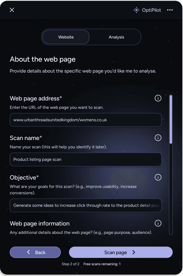
Input page/pages – User enters the website and specific page details.
Loading animation – Indicates active scanning.
Results overview – Summarises key insights.
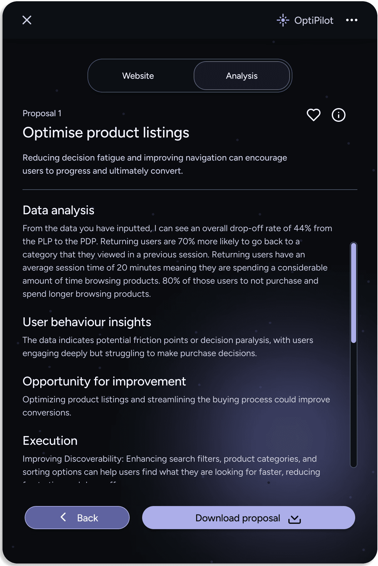
Detailed results pages – Provides in-depth analysis with the option to download., or to return to and edit the input pages.
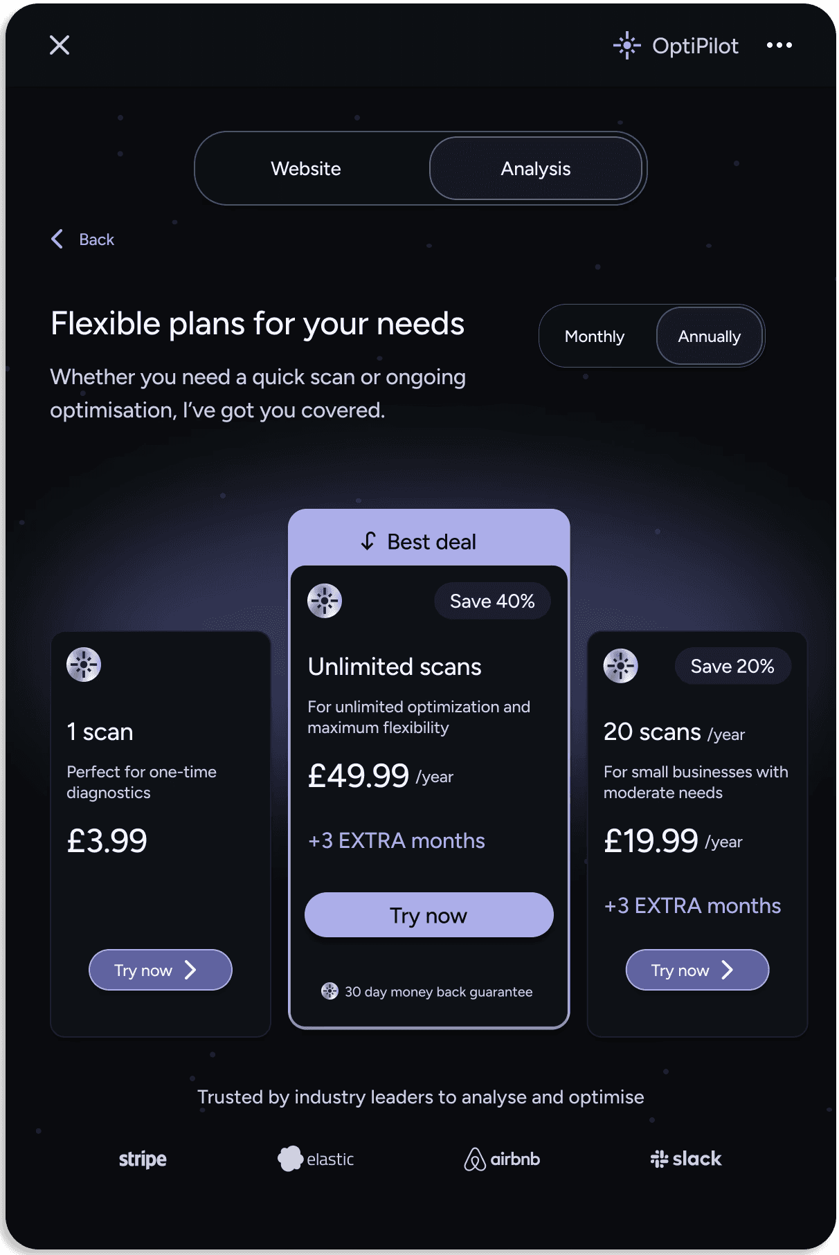
Pricing page – Showcases plan options.
This structured flow improved clarity, usability, and engagement, ensuring a smooth transition from input to actionable insights.
A simplistic and modern typeface
With the low-fidelity designs finalised, I moved on to the UI design.
I opted for a single font to maintain simplicity, given the product’s straightforward function and limited screen space. A modern, sans-serif typeface was essential for clarity and readability.
After exploring tech-focused fonts, I chose Figtree for its clean, contemporary look. It strikes a balance between familiarity and uniqueness, aligning with the product’s identity while ensuring legibility. To maintain consistency, I created a type system defining font sizes for headings, body text, and labels. This ensured a clear visual hierarchy and met accessibility standards.
Exploring visual design
With the structure in place, I focused on increasing fidelity, refining the UI, and establishing a cohesive visual identity. I chose a green and dark UI scheme—green symbolises growth and trust, aligning with the software’s purpose, while the dark background enhances contrast and reduces eye strain. This also complements TopFlight’s branding, ensuring a polished, professional look. To add depth and modernity, I used subtle gradients instead of flat colours for a more engaging interface.
To reinforce OptiPilot’s identity, I explored visuals inspired by navigation and discovery. Subtle stars and lighting effects created a futuristic, high-tech aesthetic, evoking AI-powered exploration. These elements enhanced the design without disrupting the visual hierarchy.
I also introduced a scanning light animation to engage users while they wait for a page to be analysed. Grounded in the law of motion, this effect makes the experience feel dynamic and purposeful, reducing perceived wait time. It reinforces the product’s theme of intelligent guidance, making the AI-driven improvements feel intuitive and responsive.


Revisiting the colour scheme
After a progress review with the stakeholders, they requested an alternative colour scheme, as the green and dark UI felt too similar to their main website. They wanted the product to have a distinct identity separate from the parent company.


Finalising the colour scheme and visual identity
After exploring alternatives, I suggested a purple and dark UI. The cool colour palette reinforced the product's modern, remote, and almost otherworldly feel, distinguishing it from the typical tech colours like blue and grey. Purple, associated with creativity, luxury, and wisdom, gave the product a forward-thinking and sophisticated identity.
I also removed the gradients for a flatter design, to simplify the visual style, ensuring the product remained distinctive while prioritising clarity and usability.


Voicing clarity concerns
With a UI that addressed both the user's and client’s needs, I focused on ensuring future scalability by creating a component library for easy updates and designing hover and pressed states for interactive user feedback.
During a follow-up meeting with the stakeholders, I raised concerns about the clarity of the wording they had outlined, such as terms like 'hypothesis', 'ideation', and 'primary objective'. While these terms might resonate with developers, they could confuse the non-technical target audience, potentially leading to a poor user experience and increased drop-off.
While the PM and CEO were pleased with the designs, particularly approving the creativity behind the brand identity, they were hesitant to change the language, as they felt it aligned with their internal processes.
Given the concerns, I advocated for user testing as the most reliable way to draw objective conclusions and assess whether the language genuinely affected the user experience, which the stakeholders agreed to.
Optimising the UI prior to testing
Before testing, I used AI heat mapping on key screens to assess user interaction, following Fitts' Law for optimal element placement. The heatmap revealed areas of high and low engagement, prompting adjustments to component sizing and placement, such as decreasing logo size and increasing contrast for the scroll bar.
I focused on whether key elements were noticed, but wanted to discuss user reactions to layout changes during the testing phase, as some seemed counter-intuitive. For example, the suggestions that the ‘Edit input information’ button on the results page should be primary. While making it a primary button could drive more scans, benefiting the business, the page’s main focus is AI-generated suggestions. Keeping it secondary ensures a better user experience.
This feedback reinforced the need to prioritise key elements, but demonstrated that AI scans aren't always accurate—user testing can validate design decisions over AI suggestions.


2. User testing and improving
Four research methods, two users
I conducted two virtual user testing sessions, each with one participant—both former clients of the stakeholders with design backgrounds.
The goal was to gather both qualitative and quantitative feedback through:
Usability testing
A/B testing
Heuristic evaluation
A survey
The extension was well received for its potential to reduce design time and costs, as well as its visual design and usability. However, users highlighted areas for improvement:
AI transparency – clarifying how suggestions are generated
Navigation – streamlining the user flow
Technical language – simplifying terminology for broader accessibility
User testing confirmed my user-centred approach, validating that keeping the ‘Edit input information’ button as a secondary action was the right choice for usability. It also supported my hypothesis about the need for simpler language, pushing stakeholders to approve the simplification of technical terms.
However, stakeholders remained somewhat uncertain, questioning whether users outside of design would also need simpler language. To strengthen the findings, I proposed future testing with a more diverse participant pool. As no additional users were available, I created a user persona from a different demographic to test my language hypothesis further.
Positive feedback
Both users found the concept of the extension exciting and expressed that it would be a valuable tool for saving time in identifying and implementing design improvements.
Both users found the UI visually appealing, with a clear and intuitive design that required minimal prompts for navigation. No major UI issues were reported.
Functionality improvements
Users requested a progress bar for the scanning process and clearer communication about the number of scans remaining.
Both users were sceptical of the AI’s conclusions and wanted more transparency, including written analysis of the data.
Preference for uploading PDFs instead of images for easier data extraction.
The 'packages' section was unclear and poorly placed. Suggestions were made to relocate and redesign this section.
Uncertainty about how to exit the extension; users requested a more intuitive exit option.
Content improvements
Users requested clearer distinctions between data types (e.g., quantitative vs. qualitative) and in general struggled with technical language, suggesting simplification and the addition of information icons or tooltips to clarify inputs.
Confusion about input names (e.g., 'primary objective').
One user suggested incorporating hyperlinks into the input process for added capability.
Validating findings
To strengthen insights from a small user testing sample, I created a business owner persona to shift the focus beyond designers. This approach aligned with both a target user and target buyer, ensuring clarity and balancing user needs with business goals, helping to assure stakeholders.
Since business owners need quick, easy-to-understand solutions, this reinforced my focus on creating a design that provides clear, actionable insights in simple, non-technical language. This allows users to make informed decisions without professional help. The approach reassured stakeholders of the importance of prioritising usability and simplicity, ultimately gaining their full support for the language changes.

User persona findings
Harry Jones - Owner of 'UrbanThreadz' online clothing
Frustrations
Requires quick, clear solutions that fit into a busy schedule and are easy to understand.
Relies on trial and error, leading to wasted time and uncertainty.
Competitors seem to be outperforming him, but he’s unsure why.
Wants expert-level insights without the high cost of hiring professionals.
Struggles to identify which website changes will genuinely improve conversions.
Final result
The final result is a user-centred design that meets user needs and aligns with the client’s vision to reduce the time and cost typically involved in redesigns. Through rapid prototyping and refining the user journey, I created an intuitive, visually engaging interface that simplifies the process and accelerates decision-making. I experimented with colour schemes and visual elements to establish a distinct brand identity, setting the product apart from the parent company, as the client requested.
Advocating for accessibility, I pushed for user testing, which validated the need to simplify technical language. Leveraging AI heat mapping, I fine-tuned the UI for clarity and usability, delivering a functional MVP that balances ease of use with visual impact..


3. Last-minute scare
Tackling unforeseen dimension changes
After the developers began working on the designs, we discovered the needed dimensions were 600 x 600 pixels, not 600 x 900 as initially expected. This made the components too large and disproportionate for the shorter screen.
Although the stakeholders were eager to move forward, I justified my decision to revisit the designs by highlighting that the usability and integrity were compromised. Adjustments were necessary not only to ensure a seamless user experience, but also to protect the business's investment, ensuring that the design would deliver long-term value by balancing both functionality and aesthetics.
While remaining within the allotted timeframe, I utilised the Laws of UX to rapidly improve clarity and usability. I reduced the logo size, aligning with the Law of Proximity, creating a clearer visual hierarchy and allowing users to focus on functional elements. I shortened the header to increase the scrollable area, applying Hick’s Law to reduce decision time for users and enhance navigation. I moved the tabs indicator, adhering to the Law of Visual Hierarchy, simplifying navigation and making it easier for users to find and switch between options. Inspired by other compact Chrome extensions, I made the buttons scrollable to maximise the viewable space, reducing clutter and improving accessibility in line with Fitts’s Law.
Additionally, I adjusted the title height to ensure input boxes remained visible above the fold, maintaining usability and encouraging engagement following the Law of Visibility. I also refined the scroll bar’s UI, subtly changing its colour as the user scrolls to provide immediate feedback, in line with the Law of Feedback, keeping focus on the primary button.


Visually distinctive yet intuitive.
Designed, tested and finalised within three weeks.
Balances user needs with business objectives.
Key learnings
Adaptability is essential
Balancing client requests with user needs
Navigating client preferences, such as the initial choice of language, while adhering to user-centred design principles showed the importance of balancing client input with accessibility and usability goals.
Collaborative work with developers
Maintaining close communication with developers was key to aligning expectations around technical constraints, leading to smoother adjustments when issues like dimension discrepancies arose.